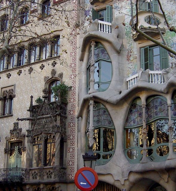
Overall a very pretty picture. I love the building. The sign, seems like an afterthought here, because the building is really what the picture seems to be about. Placed so low in the photograph, and taking up so little space, it is almost not there. If anything, it seems to be in the way of the street lamp. I do like the colors, and the focus. The lighting could be a little bit brighter but it is not bad. This would have been a very good photo for the "My Corner of the World" challenge.
That's a really beautiful building. Interesting composition -most photographers have tried to fill the frame with a road sign whereas you have chosen to minimize it. I like it.
I like the architecture of Gaudi a lot: it's so different to anything else. Only Hunderwasser-buliding can reach him a little, although the styles is of course different.
To your picture: In my opinion you should have saved this treasure for a different challenge, where it fits better. In this building there are so many things that almost every challenge is suited. Hover, road-signs do not fit too well: the no-parking sign is in my view only disturbing and I would not call a building a road-sign.
For presenting the building itself, the composition should be changed: the tree-branches on the right side disturbe, on the left side not. A closer point of view, more of the Gaudi-building and the use of a different angle of view would have made the picture more interesting.
What an amazing building. The sign takes away a lot from the building, if it didn't have to be there. Extraordinary. Did you try this in black and white? Just curious - Love the shot. - Inspzil
I love the building in this photograph :) it's a very different structure. It just looks like the sign was thrown in as an afterthought.I think if maybe you had been able to concentrate more on the sign and maybe the windows above it, it may have been a much more successful photograph -Annida
Beautiful old building and beautiful photo, but I don't understand what the sign means. I thought the line through was the universal sign for "no ........." or "not allowed" (what ever is pictured inside the circle". What is "not allowed" here? What am I missing? I love the hanging wisateria and the building. In fact I love the whole photo, just can figure out the sign. I'll give it a 7.
What a fantastic building, would have done so well in the windows and doors challenge, however is a bit weak on the signs! Still, I love this! Isn't this the same architect whose ideas they are thinking of using for the Gound Zero site?
composition is not good. i would have tried to angle up the sign to the building but that may be impossible here due to the light post. in any case the sign just isn't a big enough part of what's going on here
Wow, that is one beautiful, ornate building. Interesting how there seems to be two architectural styles, one more modern and the other more "ancient". O.K. I see your sign, but it seems to me to be less the subject and more "incidental" part of the photo. Very good photography. 7 Swash
What a lovely building (we have no architecture like this in Australia really). You've managed to include a sign although it looks a little out of focus - the main building is focused very well.






 Add photograph to your favorites
 Add photographer to your favorites


 Photographer found comment helpful.


