COMPOSITION
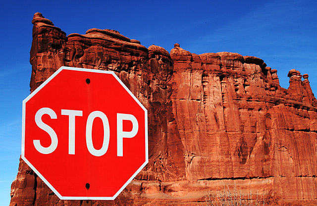
I think overall the composition of this shot is effective and strong. The sign is in a good spot to "anchor" the shot, and the top of the ridge leads from left to right and up to down nicely. My only suggestion would be to frame it so that the edge of the sign and the edge of the formation weren't so nearly in line. It almost makes it feel unbalanced to me.
TECHNIQUE
I love the colors on this. The reds and blues provide a nice complimentary/contrast with each other, and it is really attention grabbing. The focus is awesome, with details showing throughout the picture. One thing to consider might have been a lower aperture number that would cause the formation to be blurry behind a crisply focused sign. Don't know that it would have been better. Just different.
OVERALL EFFECT
Very nicely done. It is the kind of picture that grabs your attention then holds it.
thanks for all the comments on this shot. I was excited to see how well it did, it was the only one I took all week. It was also my first time shooting in the RAW format which I love now.
There doesn't appear to be a sign post on this sign. I like the rock formation bery much and the coloring is fantastic. But something's not right here. Nice photo but can't figure it out.
I like your background, but I do not get the point of this sign being here? Im trying to determine what you want to tell me and I am not getting it. For your crisp colours and sharp focus I am giving you a 7 still though. jgillard7
The red sign against the red of the rock and the blue of the sky create a nice effect. The colors seem a tad oversaturated for my liking, but still very attractive. Positioning of the sign seems a bit off - maybe higher and to the right just a bit might have helped. Very nice how the sign post gets lost against the rock - makes it seem as if it is floating. Nice photo, good job. 7 md
Wow - that's certainly an interesting place to find a STOP sign. Your colouring and focus is brilliant - so much detail. The sign is also "crispy clear". My only (possibly) negative comment would be the alignment of the left edge of the rock and stop sign - perhaps more or less overlap between the two would be better?
Great idea and flawless execution. I know your subject was red, but I do wonder what a black and white would have done here to help in contrast. The sign "pops" but not huge due to the same hue. At first I didn't like the inclusion of the sky on the left hand side, but now, I think that is what makes the picture work. I like the placement of the sign it is pleasing to the eye, your focus was just excellent everything is just sooo crisp. THere is a small bush in the lower right hand side, but due to the colors it really does not stand out. In fact I didn't notice it till about the tenth time staring at the shot. Great job.10.






 Add photograph to your favorites
 Add photographer to your favorites

 Photographer found comment helpful.


