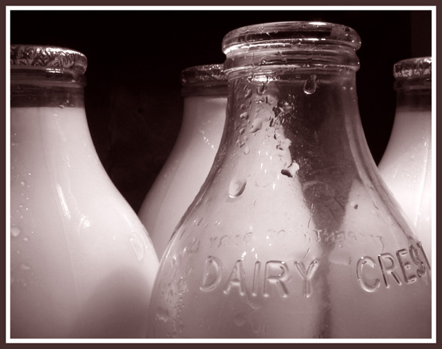
The main thing that I don't like about this photo is the title. I don't know why, I just don't. And since that is such a trivial thing I think you can tell how much I like this photo. It is just so simple and clean with very interesting visual elements to hold your attention. What I think I like best is the way that you didn't overdo anything in the composition. There seems to be just the right amount of milk bottles, the right amount of water drops on the bottles, and the right amount of visual balance between the positive and negative spaces. I bet you really studied your photos and cropping options before you settled on this because it appears like you put a lot of thought into it and made the right decisions. I enjoy the photo for it's visual imapct as well as it's abstract qualities. You presented the photo very well with an appropriate border and a clean, sharp image. Very well done.
Great focus and good job capturing the details on the glass with minmal light reflections. Something about hte composition has me off-kilter though. I think it is because the front glass and the back one are "almost" lined up, and it feels like the back one should be scooted to the left just a touch, and the other three rotated counterclockwise to "fill" in the spaces. Still, that is probably just me. Great crop, and an overall great picture.
My favourite photo this week. I wanted to do a photo of milk bottles too, but couldn't get hold of any - we get all our milk from the supermarket round here. Like the water droplets on the bottles.





 Who`s Got Bottle
 Add photograph to your favorites
 Add photographer to your favorites

 Photographer found comment helpful.


