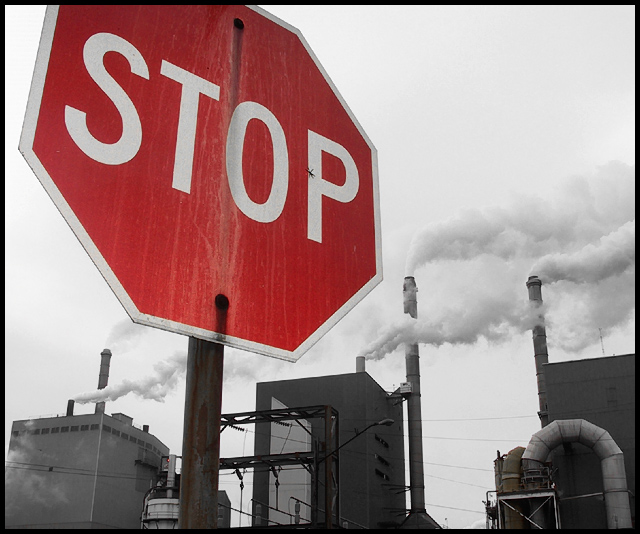
A local paper mill spewing forth. The image was cropped, all channels but red were desaturated. Played with contrast, red levels and sharpness, then added small black border.
Statistics
Place: 10 out of 174 Avg (all users): 6.4950 Avg (commenters): 7.5667 Avg (participants): 6.7281 Avg (non-participants): 6.1860 Views since voting: 2206 Votes: 200 Comments: 34 Favorites: 2 (view)
The image says it all!!! No title was necessary. I liked the idea that you incorporated your sign with the back ground image. Advanced thinking skills. The color of the sign and the black background and image works absolutely great together. I am shocked you did not score higher.The cropping everything works. No less than a (9) from this judge. JG
congrats on your placement. i rated this photo very high and am glad that you got the recognition you deserve for this shot. i figure top 10 to 15 could always be top three depending on the mood of the voters. this is a fantastic shot. cheers, tom
Thanks for all the comments. Woo hoo, my first top ten finish! Regarding some of the comments: I also wanted the entire stop sign in the photo, but unfortunately, there was a street sing on top of the stop sign which really distracted from the shot. I felt it was better to crop off the top than to leave on the sign. A copy of the original shot can be seen here...
If I could have selectively desaturated, I would have removed red everywhere except for the sign. Lastly, this was taken at a paper mill. I don't know for sure if the stuff coming out is steam or not, but I highly doubt it as it stinks of sulfur and can be smelled for miles. regardless, that's not the point. This is not about this one particular paper mill, or paper mills in general. This is meant to be more of a symbolic reflection upon the waste and pollution which is deposited into our ecosphere with rapidly accelerating abandon. It's merely my own personal statement reflecting my opinions about man's propensity to destroy his own environment.
Thanks again to all who commented. The time you took to share your thoughts was greatly appreciated!
Nice photo. I think it would have been better to include the top of the sign rather than cropping it off but it's still a good shot. I like the lack of colour in the background buildings but I keep being drawn towards the little red light on the building on the left.
really nice photo, good message too. like the fact the stop sign is red against a very muted background. only thing that distracts me a little is the sign cut off at the top. still, a 10.
Very nice graphical composition. It seems several people (including myself) chose to have colored signs with desaturated backgrounds in this challenge, but I think I like yours best of all so far. The steam or smoke adds a nice dynamic to ths shot and the b/w has very nice tonal qualities. (8)
Very good capture and the idea is great. The background seems to be black and white which enhances the stop sign greatly. This photo is one of my favourites and gets a 10 from me.
Nice use of selective colouring - there's just one tiny red light on the leftmost building. I like the title as well - very smart. The simple border is nice - just enough to frame the image without taking it over. Well done. Any reason why the sign is partially cropped? Is it just to stop the sign from totally taking over the image?





 Add photograph to your favorites
 Add photographer to your favorites

 Photographer found comment helpful.


