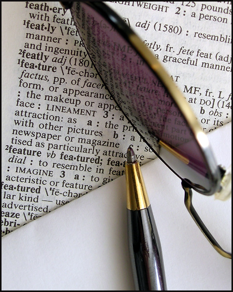
Good thinking outside of the box. I'm not crazy about the composition though, although I think the idea is really good. The focal point of image seems to be where the pen tip, glasses and blank paper converge, but there is nothing there to see. Had you been able to have them converge on the boldface type of the word featuer in the dictionary, then I think it would have had more impact. Also, I don't really care for the color rendition and think B&W would have worked better. One more thing is that I would have liked to have seen the focal point rest on one of the intersections of the rule of thirds.









 Add photograph to your favorites
 Add photographer to your favorites


 Photographer found comment helpful.


