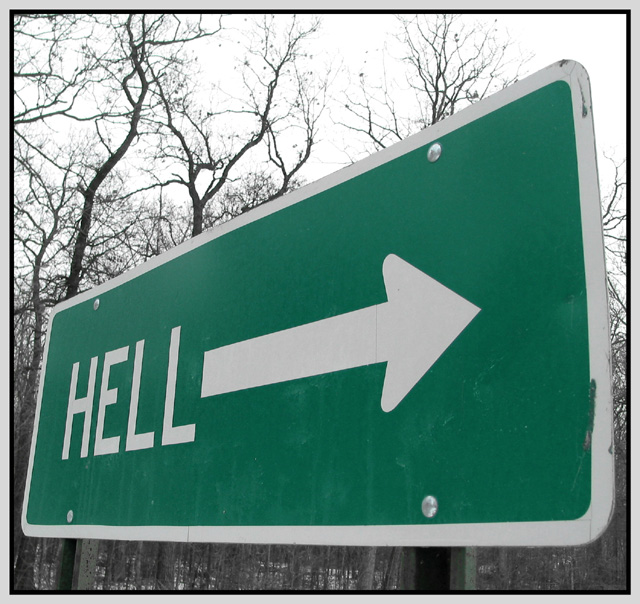
I like the composition of this shot. The sign makes a good strong statement in this image. The color is a bit flat overall, but I can see in your description that you have desaturated everything except the two channels. This is probably a good option for making your sign stand out in the image, but I think the sign already stands out since it fills most of the frame.
Did you try this in black and white? I think your sign offers enough contrast to do a very nice b/w here as well.
The sharpness seems a little weak overall. Maybe a pass with the sharpen filter would fix that up some. When I shoot an image at an angle like this, I usually try to use a little deeper depth of field also. In this instance, I probalby would have composed the shot the same way you did, but I would have backed up and used maximum zoom to help blur out the background some more. Your depth of field here is pretty strong for an F2.8 shot.
I like this angle, I might have even liked it better were it a stronger angle, but maybe less personally insulting were it pointed away from you. Very good focus. Framing works well. Background is nice. 8 Swash
The road to hell.......Great shot I really like the saturation effect with the green and greyed out background. The angle is just great, gives it a really cool perspective. The trees are a bit washed out, but not too bad.9.
Perspective and framing is very good. The trees in the background are good. As a suggestion I would have rotated the image slightly - either have the bottom of the sign exactly horizontal of the arrow exactly horizontal, but it still looks good as it is now anyway. PS: A bonus point for finding a sign that says "Hell ->"
this is really cool-- the composition, framing--this is even one of the few color desaturated pics i have seen that i really like! the wintry trees make for a nice backdrop. very noce work!
Now I know who's footprints are in my photo. lol. Great choice of signs! How far did you have to drive to get there? Good thing you didn't get the same angle as me cause you couldn't call it "paved" with good intentions. The road up front isn't paved. lol. I like the angle a lot. Color of the sign is good. you had the same prob as me with the sky though. Great focus and clarity. We were there Sunday around 2pm and ate at the Dam Site Inn. Wonder if our paths crossed? Good luck to you! It's a great sign!! :)





 Add photograph to your favorites
 Add photographer to your favorites


 Photographer found comment helpful.


