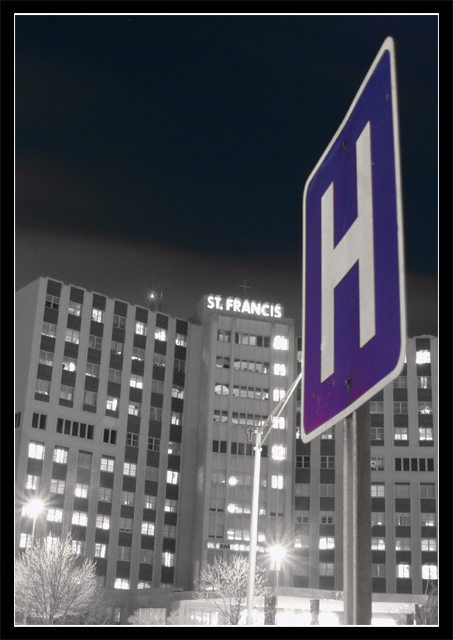
If this shot was really sharp, it would be stronger. I wonder if you used a tripod? Even if you did, that's a looong exposure :).
Another way to improve might be to use more contrast. As it is it's sort of gray, with the one color present adding to the low temperature feel. Use your curves or levels tool to play with this.
The title, while clever, doesn't imho fit the shot :). So I'm choosing to just look at the image as if it was untitled.
The tilt has been remarked upon, yet your H sign is level, so that's good. That's prolly all a function of e-20 lens distortion at wide angle. I might have had the H sign leaning in.
Like the use of desaturation in this photo. All the vertical lines in this shot made it difficult. A little less exposure might have kept the windows a little bit less overexposed. Good photo, good luck.
This is a very good composition but I´m not so sure about the focus. Focus on the sign is OK. I know it´s hard to take this kind of photos so I think you have done a great job. Hgh score from me.
Love your night shot. The Blue and White sign against the Dark Sky with the Greyness of the Hospital and the lights shining from the parking lot. Great shot.
Strange. The hospital appears out of kelter, at least with the sign, like it's leaning a little. But the sign appears perfectly perpendicular. Must be the angle. Great title for this shot. It adds to this one. I also like the frame/border. It's a 6.
The border suits the black and white building well. You certainly did a good job of bringing attention to your sign by washing the rest of the image out. The street lights have a lovely flare, however the St Francis sign looks like there was maybe a little bit of camera shake (just a tiny amount). Composition is good. Good work.






 Add photograph to your favorites
 Add photographer to your favorites


