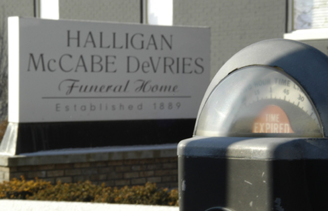
I have been wanting to take this shot for three years. Every time the light was wrong, the was bad, or someone was parked and still had time. This week I stopped by at 5 different times so I could get just the right light...no such luck...I ended up setting my tripod up so the pole was placed in just right the position to block out the glare but leave enough light so you could see "time expired". It's far from the shot I was hoping for, maybe in another three years...
Statistics
Place: 49 out of 174 Avg (all users): 5.7656 Avg (commenters): 6.0244 Avg (participants): 5.5085 Avg (non-participants): 6.0989 Views since voting: 1433 Votes: 209 Comments: 42 Favorites: 0
Conceptually this shot is very strong. It tells a story, which is more than many do.
However, with this good of a camera system, there was no excuse for any of the important elements of the image to be out of focus. This really hurts the shot.
I'm especially troubled by the lack of foreground sharpness. At the very least the meter should have been razor sharp. Looks to me from your aperture setting that you tried to put your focus somewhere between the meter and the sign in hopes of including both. I think you would have been better off with a really sharp foreground.
Post processing also could have been employed to boost sharpness and perhaps color saturation. There's an orangey cast to the pic which isnt bad, but I wonder how this would have looked on an overcast day?
Good idea that I think deserves another attempt :).
Nice point of view, good eye. I wish it was a bit sharper in focus though. I noticed that you only used 55k of the 150kb file size allowed. That would certainly have added some sharpness.
Good eye! Very good shot. It's too bad camera's don't have dual focal ranges, this would have been a good shot for it. Color seems a little muted (just a tiny bit) 8 Swash
I really like the idea of this shot and you may have done this on purpose, but I would have liked this even better if you would have used depth-of-field to make both the meter and the sign in focus. Very creative.
lighting is too harsh on the meter, sign in the background isn't in focus, which would make this photo much better. also i'm not sure if a meter is a sign but whatever, this is well composed
Haha, very ironic indeed, clever manipulation of the challenge topic. Excellent use of location and composition. It's also very refreshing after looking through the myriad of 'regular' road signs.
Yes, very ironic. Everything is a little bit soft, although I suspect that's a result of struggling to get enough depth of field to include both objects.
This is so almost a ten, Great idea, if the meter were in focus or at least clear or cleaner to make more of a pleasent item, and if the sign were in focus this would be a ten for sure.,..,,..,,..8
very original. too bad the focus on the funeral home is a little soft (although i don't know if it could have been done better given the DOF challenge inherent with the shot).
Very clever! I\'m partial to photos that put the sign in a situation where it compliments its surroundings, and this is one of the best ones. It could be just a BIT sharper, but great job! 9






 Add photograph to your favorites
 Add photographer to your favorites


 Photographer found comment helpful.


