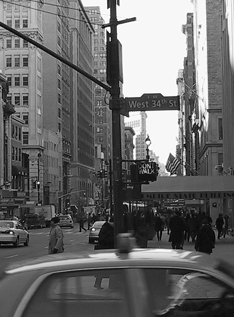
Should have cropped the car off the bottom of the photo. In my opinion, I would have cropped it just below the "Don't Walk" sign. It would have helped in several ways - lighting could have been adjusted better, for one. Also subject would have been easier to identify. Is this "THE 34th street" of Christmas movie fame? Lighting too dark on bottom right side.
somebody's gonna tell you they don't like the blurry cab, don't listen to them. would like to see this in color as well, looks like a spectrum full of different shades, did it look too busy in color maybe?
black and white works well here. the moving taxi can either be good or bad. i can't decide but i'm leading towards good because i'm thinking you left it in trying to show the hurriedness of taxies in the city. overall, the sharpness leaves a lot to be desired, and there is also a lot of noise. not a bad photo though by any means
Nice classis style photo. The blurred cab in the foreground conveys activity, like you have frozen a busy busy world. The image is a little soft - making it looks perhaps older than it really is, but this isn't a bad thing in my opinion. Well done.





 Add photograph to your favorites
 Add photographer to your favorites


