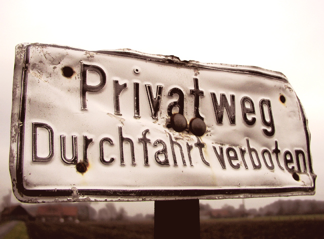
This is in German and means "Private Road, Entry Forbidden". I guess some people didn't like it and beat the sign up a bit. I found it whilst driving around the country near where I live. I adjusted the curves and levels a little in Photoshop.
Statistics
Place: 23 out of 174 Avg (all users): 6.0406 Avg (commenters): 6.6875 Avg (participants): 6.0991 Avg (non-participants): 5.9651 Views since voting: 2403 Votes: 197 Comments: 18 Favorites: 2 (view)
FIRST IMPRESSION : simple, give almost a duotone picture, Good depth of field. No waow factor.
COMPOSITION : The cropping might be a little too tight and I am wondering how it would have looked with just a little bit of space so that the sign does not seems to 'sit' on the horizon line. Maybe would have been a little better.
I like the colors, very simple.
Maybe the 'stuff' in the lower left corner is a little distracting.
No WOW factor (but it does not need to have one :-) but more looking at the picture I like it more.
The sign by itself is very nice, beaten and torn.
TECHNICAL : VERY GOOD usage of Depth Of field, the sign is fully in focus zhile the rest is blurry. This makes a little less important my comment above as the sign is sepaarated at least in term of depth from the background.
DIGITAL : no sign of digital processing = good.
My Opinion : I like this photo better now that I have spent some time on it. It brings a lot of 'rural' feelings and connotations.
And the depth of field is very significant in that case. Congratulations
Very simple photo, but it has a lot of character. Nice clarity on the sign. Composition good, with the sign resting just above the horizon. Maybe a little too closely cropped - a little more breathing room around the sign may have helped. All in all a very nice entry. 7 md
Great focus and colour. It looks like the sign has a lot of history to it. The lighting and depth of field help to ensure that the sign grabs my attention and holds it. Well done.





 Add photograph to your favorites
 Add photographer to your favorites

 Photographer found comment helpful.


