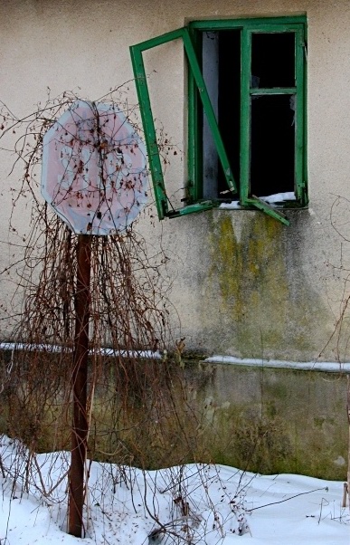
This is so well done. The problem I think you might run into here is the sign is not the main focus of the shot. I know it’s not required that it be the main focus, but many of the voters tend to have a very narrow vision of meeting a challenge. This is a “road sign” photographed in all it’s natural glory. I like the artistic elements present in this shot. However when I look at this, I think of cool bright colors, green moss, broken windows, weeds, abandoned buildings…… One of the last things to enter my mind is “road sign” I often get annoyed with this aspect of the voters on DPChallenge. It seems a failure at times for many of them to see the art within the picture. It’s not easy to make a work of art out of a road sign. - This is a great shot, one of only two 10’s from me this week. Good Luck with the rest of the voters.
Sad, compelling, quiet and a little creepy. Very evocative photo. Nice composition and mood. Green window pane balances the image well. Very nice. 9 md
The topic of your picture is awesome and your composition with the green windows too. I thing it could have been improved by lowering the saturation of the colors yellow, blue and even red and strenghten the green. I tried it and in my opinion it looks better: the dirt below the the window will look not as dirty but rather like a patina. A frame might have been nice too.
Still a wonderfull picture. good luck to you.
Cool find, it sure looks like a long lost forgotten sign. Besides the fact that the sign is faded, I think the shrubbery really adds the touch to create the image of forgottoness. Due to the nature of the shot there are not many colors, except the green, I think I would like to see this shot in black and white. The placement of the sign is great, focus is good, and in this shot I really like the inclusion of the whole post. 7.
This is my absolute fav foto for this week. Ultra superb delicate pastel hues. Really really appreciated muted tones in contrast to the screaming dayglo colors common to this website. The mood is very well felt with the washed out red stop, the growth, the crooked window frames, the snow,etc. I like the nice touch how the window frame leans against the sign. The tight composition accentuates the impact of each visual element. The overcast lighting allows the gentle colors to have full voice. This is indeed a first rate masterpiece that deserves many more positive comments. Please continue with such wonderful inspiring work. A fantastic image. ...9
Good title! The dead vines remind me of those pole christmas trees some people make, using just a pole and strings of lights. The window in the background addes to the desolation. Nice find! It's a nit that you've probably heard before, but the free hanging branches on the right needed to be cropped (IMO), but not enough to change my score. To me, this is falling somewhere in the 7 to 8 range, I started it as a 7, but it's growing on me. Let's go 8! Swash
I'm glad you showed the sign going in the ground. Otherwise I would have thought it had been placed there by some kids. Sure hope the road wasn't that close to the building. Doesn't make sense. Great photo but still doesn't make sense putting a stop sign there. I'll give it an 8.






 Add photograph to your favorites
 Add photographer to your favorites

 Photographer found comment helpful.


