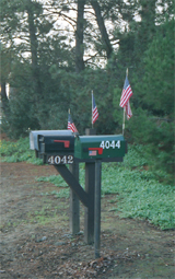
FIRST IMPRESSION: I was surprised that you submitted such a small photograph. The Nikon D1 is a fairly capable camera at 2.6 megapixels, and you would do yourself a service to move in as close as possible on your subject so you can submit a photograph that is close to the full 640 pixel limit.
CHALLENGE: I think this photograph "sort-of" meets the challenge, albeit in an unexpected way. I'm sure some photographers marked you down for not meeting the challenge in the way they expected (a flag isn't "really" a sign), but I personally don't mind a bit of creative license with the challenge topic.
COMPOSITION: Probably the most disturbing aspect of the composition ot me is that your main subject (the flags and boxes) is centered in the frame. You may have been able to improve your shot by utilizing the rule of thirds in your composition (there is an excellent tutorial on the rule of thirds on this site. While the Rule of Thirds is not a hard and fast rule that works for every photograph, it can, in most cases, strengthen a composition.
It is also worth noting that there are a lot of distractions in this photograph. If you had cut out more non-subject material (try cropping just below the boxes and just above the flags, and just to the left/right of the boxes) this may have been a stronger entry overall.
TECHNICAL: Focus, depth of field, color, etc, all seem good, but to be honest it is difficult to assess those factors at this size.
CONCLUSION: i think this subject had a bit more potential, and was certainly a creative idea. I think next time letting the viewer see more of your subject (and less of what isn't your subject) may help you in the future.
Thanks for sharing and good luck in future challenges!
Well, a couple of things going on here. First, the pic really is too small. It's best to use the space that we're allotted. Secondly, mailboxes don't really qualify as road signs, at least to me, and thirdly, the whole thing is a little washed out and the lighting is dim. Perhaps fiddling with the color in post processing could have given you a bit more punch.
I'm not sure if you did it on purpose but the photo to me appears out of focus. Was that intentional or do you need some advice. It also appears grainy you may need to check your settings. Finally it is small if you reduced the photo do you know that you can have a photo as large as 620?
You should submit a picture a little closer to the allowed maximum, as that is much more effective in presentation. Looking at this picture: the colors seem a little washed out, and it might have been better composed if the mailboxes were on the right side of the picture, and part of the road on the left...anything that didn't have the mailboxes smack dab in the middle.





 Add photograph to your favorites
 Add photographer to your favorites


 Photographer found comment helpful.