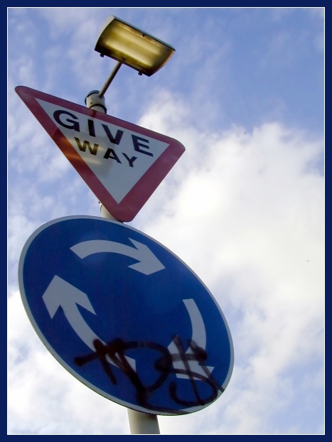
Took several photos of road signs, getting weird looks from the drivers going past. Liked this one most. Levels adjusted in Photoshop Elements, gamma corrected in PSP.
Statistics
Place: 81 out of 174 Avg (all users): 5.4709 Avg (commenters): 6.1250 Avg (participants): 5.5526 Avg (non-participants): 5.3696 Views since voting: 1126 Votes: 206 Comments: 10 Favorites: 0
While the perpective certainly makes this photo an interesting one I feel a little uncomfortable with how much the left edge is being crowded. I would like to see the angle of the pole exaggerated even more so that the round sign is positioned on the right side with the top of the post in its same location to create an even more dynamic look and feel to the image. This positioning would also create triangular shapes in the negative space that would compliment the triangular sign. The reflection of the light bothers me a little as well and maybe the use of a polarizer filter could have reduced the reflection. You chose a good background that adds to the dramatic effect. The colors are good and overall the photo is very sharp and clean. The border does a nice job of presenting your photo without overpowering it. All and all you did a nice job with this photo.
I'm really surprised that this one didn't do better. Ironic really that the grafitti that so many people didn't like was the whole point of the photo!! It was a shame that the reflection of the light was there though.
the signs are too dark, the reflection of the light isn't a plus, the graffiti also takes away. this is a good example of how to use perspective to make your photo stand out against the sky
I sure wouldn't know what to do here. I'd give way to everyone I guess and not move until I was the last one left. Love the angle you took it at. That adds at least 2 to 3 more points. Good focus and crop. Real nice job. It's a 8 from me.





 Add photograph to your favorites
 Add photographer to your favorites

 Photographer found comment helpful.


