COMPOSITION
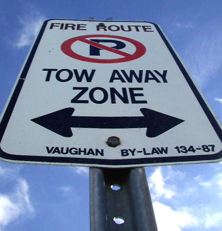
You have chosen a good angle from which to photograph this sign. It adds interest and makes it more dynamic. It would appear that you are going for a symmetrical look, in which case I might suggest croppping out the post, as it seems to be a bit off-center. I don't want to sound picky, but it seems that shots do better if they are exactly symmetrical, or way off.
TECHNIQUE
The focus is a little soft. It appears to be a bright, sunny day, so could you use a higher aperture number to improve the focus all the way up the sign. That would also prevent the slight blowing out of the clouds in the lower right hand corner. The sky and clouds add a nice "contextual" feeling to it. I think the black really stands out because of the sky. the crop may be a tad close, but I think that cutting the very corners off adds to the symmetrical feeling of it.
OVERALL EFFECT
My first impression was that this sign is 10 feet tall. Don't know if it really is or not, obviously, but your perspective makes it seems big. That is effective. Nicely done. Your score was probably effective by the soft focus, as that is the first thing people seem to notice, and many do not have time to study the pictures in depth.
Wicked angle! Very sharp photo with good color. The cloud in the lower right corner is a tad over-exposed, but otherwise really nice. Might need a little more interest factor..... 7 Swash
It looks like you struggled slightly with depth of field - which is understandable. It also looks like you took the image very slightly off centre - the bottom bolt is near the centre, but the top one is definitely off. This isn't a big deal though - I guess I just like symmetry.





 Add photograph to your favorites
 Add photographer to your favorites


 Photographer found comment helpful.


