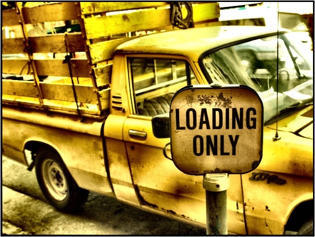
Post processing is not something I generally do, but after looking at the entry by sulamk last week in the song challenge, I thought I'd give it a try. (Thanks for the inspiration sulmak).
Statistics
Place: 5 out of 174 Avg (all users): 6.7664 Avg (commenters): 8.0750 Avg (participants): 6.9739 Avg (non-participants): 6.5253 Views since voting: 2759 Votes: 214 Comments: 47 Favorites: 13 (view)
I love this photo. The color and aged look make it ART !
This is a photo only someone with a eye would take. Most would walk right by this truck and not see what could be :)
COMPOSITION
The positioning of the sign and truck is very near perfect, I think. It has an interestng angle that gives it some dynamics, its not just another straight on shot. The sign is in a very strong position in the frame, and the truck leads the eyes back to the left and out.
TECHNIQUE
There is very little I can comment on negatively about this. It does fill just a touch unbalanced with more of the back of the truck showing htan the front, but that is a small detail. Like someone else pointed out, the upper right of the frame is almost blown out. Maybe changing the camera angle slightly would have prevented this, or cropping it so that the top of the frame was at the top of the truck. Given those options though (assuming you can't/won't reshoot), I would leave the bright spot in and keep the crop like it is.
The tight focus on the sign, with the truck just barely being soft is awesome. You nailed that!!
OVERALL EFFECT
When I look at this, it makes me think I am looking at an old truck from a small rural community. Specifically, though I don't know the model, it seems like this picture could be from the 50s or so. Part is the truck itself, the other is the coloring, which is awesome! The sign (which looks very modern) provides a wonderful contrast.
Again, great shot, and sorry I couldn't offer a lot in the way of suggestions. You have already done a lot right!
Your post-processing judgement is spot on for this photo. I think the colors you have selected to use go perfectly with the "old" feel. The yellow of the truck, the brown of the rust, and the color of the sign (give's it a vintage silent movie feel) are brilliant. Composition wise is perfect as well. Great angle to capture both the truck and sign. I would have preferred to see more of the front of the truck as well and maybe would have increased the angle more to take out the truck in the background (which is a little hot/bright). I give it a 9.
i'm so happy this photo scored so well this week. i was worried that people would reject the color adjustments and (yellow) monochromatic aspects of the photo. i loved it, and hats off to you, great job!
Wow. I'm not sure how you got this effect, but it's fantastic. Incredible tones, and I love all that yellow. My only nit is the upper right hand corner, where things fall apart a little. Very fine.
The monochromatic theme of this image has lots of power. The rough and ready nature of both the sign and truck add lots of character to the foto. The limited DOF certainly focuses attention on the sign. Good job.
The colors on this photograph are absolutely stunning. THis is the best photograph of an old beatup pickup truck I've seen for a long time, maybe ever. The perspective is great, the angle is great. The soft focus on the truck and sharp focus on the sign are as they should be. Very well done and thanks for sharing this gem - Inspzil
What a brilliant use of colour to make a relatively boring photo very interesting. It looks like a very shallow depth of field was used to focus the sign whilst blurring the truck every so slightly - very effective for this challenge. I'll be very surprised if this isn't one of the top places when results come out. Well done. I don't think I would have done anything differently in this photo.
Normally, I do not care for shots with this much "contrast" (for lack of a more accurate word), but this one appeals to me somehow. The depth of field works well as the sign is focused, bu the truck is just a bit soft. I like the coloring as well.
The most intriguing photo of the bunch. Very skillful use of dodge & burn (??) Nice compsition, nice colors. My only two other knocks would be the mirror coming out the side of the Loading sign - seems a bit distracting for some reason. And the passing car / blown out section in the upper right. Seems out of balance with the rest of teh photo. Otherwise, and excellent photo, and so far my favorite of the challenge. Good Job! 9 md
This is a beautiful, amazing shot. The high contrast adds a cartooney feel to it, almost. The monochromatic color emphasizes that, and the overall composition couldn't be better. Congrats. Perfect. (10)







 Add photograph to your favorites
 Add photographer to your favorites


 Photographer found comment helpful.


