Critique Club Critique
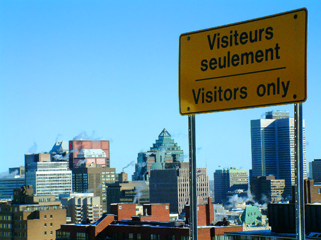
(1) COMPOSITION (CONTENT) – Very good. Sign is placed off center nicely. The city then nicely completes the photo. The relative size of the sign is very good.
(2) BACKGROUND – The city is nicely laid out with respect to the sign. The blue sky acts as good negative space.
(3) CAMERA WORK ,TECHNICAL – Focus & DOF look quite good.
(4) DIGITAL PROCESSING ,TECHNICAL – No real suggestions, looks good to me.
(5) MY OPINION ON THE PHOTO – Nicely chose sign and composition for the photo. The wording of the sign is humorous and eye catching. The major negative for this challenge would be the position of the sun and the lighting of the sign. The photo should have been taken with more light on the sign. That probably was the one item that cost you in the scoring.
This is just really funny, great idea and perspective with the city behind the sign, the title helps also. The focus is good on the city, nice and crisp, but due to poor lighting/shadow on the sign it seems to be a bit grainy. The sign placement os good, grabs your attention yet allows for the view of the city, which is important on this shot. The horizon is also nicely placed on the lower third. The colors are nice, not eye catchingly brillant, but nice for a cityscape. 7.
Funny title. I like you composition - the sign is well placed (perhaps just a little close to the tallest building under it), The shot of the city is an interesting one - lots of variety and the clouds of smoke / steam add an industrial feel to it. My biggest negative is that the sign is a little dark - I wonder if using a flash would have helped illuminate the sign since it was backlit by the sun. Well done.
Beautiful city and photo. Love the sky line and the blue sky. Strange sign. What does the top line say - a place for visitors to stay or park? Can't figure out how you got the sign photo to high up. But I like it. It's worth an 8






 Add photograph to your favorites
 Add photographer to your favorites


 Photographer found comment helpful.


