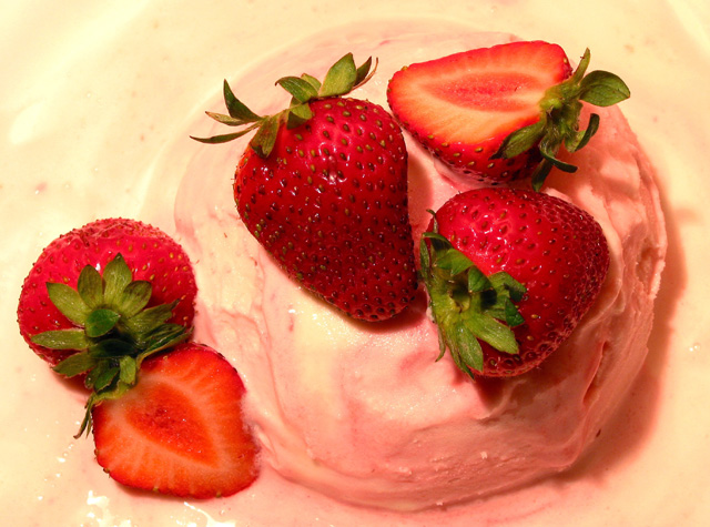
The colors here emmediately jumped out at me and made a good impression. They look natural without being over saturated. The composition is good but a little safe. In that I mean the overhead view with a pleasing arrangement is pretty common but that also means that it works well. The composition would be just fine to me if the lighting was more dramatic in some way. It appears flatter than it should be with too much ambient light. The ice cream and strawberries have very interesting forms that should be emphasized as much as possible. I would think one dominate light slight diffused on one side to produce a strong but soft shadows with a lesser light on the opposite side to reveal some detail in the shadows may work well. The amount of sharpness is right on and the image looks very clean. It is a very nice photo but some more emphasis on the forms would really make this a winner.
Nice color on the Strawberries and composition. I wish the ice cream showed up a bit better. A border may have helped this shot by bringing out the ice cream some. Good job.
the lighting seems kind of yellowish and throughs of the super red hue of the berries... maybe a white balence or post shot adjustment would help? great focus and clarity though...
ONe of my favorites this week. Gave it a 10! ! The only thing I might try to do to improve it is to try to get less reflection in the lower left area of the ice cream, although the reflections on the strawberries help make them look really fresh and yummy.
Looks yummy. I'll have a large please. Nice fresh fruit this time of year....wow.
I do think the light is too harsh and the berries are a bit over saturated. Might be due to the background color. Good challenge entry.






 Add photograph to your favorites
 Add photographer to your favorites

 Photographer found comment helpful.


