In hindsight, I'm ashamed of submitting this.
-----
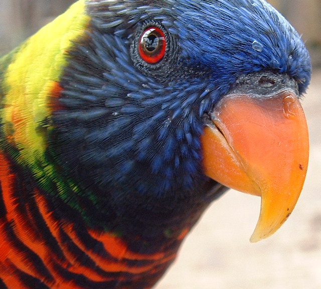
he Columbus Zoo has this wonderful walk through lorikeet house where you pay $1 for a cup of nectar and the Lorikeets land on your hand, shoulders, head, anywhere. One time I was there a lorikeet landed on my camera hand and tried to take pictures of his own! This was on my first trip to the exhibit. I'd walked by several times but never ventured in until this time, and was stunned at some of the macros I got. I used one of them in defining features and got ravaged for being off-topic. Hopefully this one will do better.
The title was something I came up with because of the colors. I dunno, titling my photographs is hard. I'd rather the challenge be on just the image, but everyone who calls their image "Untitled" or "***" or something just get voted down.
I think this photo could be improved by having a different background, possibly against some of the green in the exhibit. Also the area under the head could be lightened, maybe.
People will vote this down because of the sub-cephallical darkness and the background. Maybe on the tight crop as well, possibly on the "over saturation" though I used no post processing tools on this. Oh well.
I'm being brave, but I predict a high 5's maybe even into the 6's with this. It's good and I know it. So much for humility.
Statistics
Place: 150 out of 487 Avg (all users): 5.7773 Avg (commenters): 5.9333 Avg (participants): 5.7070 Avg (non-participants): 6.2500 Views since voting: 1138 Views during voting: 323 Votes: 247 Comments: 16 Favorites: 0
Beautiful. The only complaint that this voter has is the reflection in the eyes. If you could clone it away somehow (beyond my skill level) while leaving the pupil intact, this would be perfect! Awesomely vivid colors.
TC
Great colors and I like the reflection in the eye, could do with just a little more dof.
Focus looks like it's on his beak (is that the correct spelling?)
I love the colors in this picture and love the idea of it being so close up. I have two minor complaints: 1) It doesn't seem as sharp as it should be ... perhaps the DoF was too shallow, and 2) I like to see a reflection of light in the eyes (it makes them look alive), but in this case, there is too much light in the eyes and it is actually making it hard to see what should be the most compelling part of the image. In any case, it's still a great image. I hope to see this one up in the top 10. Good luck in the challenge!
I'm sorry, but I feel like you should have found a shot that wasn't so similar to the one you entered into the defining features challenge (I think that was the one). The angle's just slightly different, but the photo is essentiallly the same. Just my opinion.
This is a great photograph that shows off what a digital can do with extremely brilliant colors. Too bad the window reflections reveal the captivity of the subject. In a theater that tends to overuse monochome, I find this one very refreshing and well balanced in the cropping too. (8 stars)
You couldn't find anything better to enter that an almost exact replica of a photo you've already entered? I think all the comments you got on the last one apply here as well. Except that it does't meet the challenge. lol Can't go wrong in a free study, unfortunately I don't see it doing much better in this challenge than it did the last. I think your lighting was very bad for this shot, and that hurt it a lot. The only improvement I see in this one over the last is that it's not cropped so tightly to the beak.
This is a really lovely subject. I like the depth of field used here and the expression. The colours are also really beautiful and definitely "pop". if you're doingsomething like this in the future, I find portraits like this usually (not always) benefit from a bit more negative (blank) space to the side of the subejct (in this case to the right side). Using a rule of third approach (subject to 1/3 of the image) usually balances out the composition and makes the subject stand out (plus, studies show the rule of thirds is the most visually appealing. It isn't a steadfast rule... but would apply nicely in this situation. Your eye wants to move a bit toward the direction where the bird is moving and it's limited with this crop. Just some advice - a good image overall though.
Very nice color. The DOF seems just a bit too tight, blurring already just beyond the eye. Also, the placement of the catchlight in the eye causes a problem for me. I realize it may be hard to get the bird in the perfect position right down to the catchlights, so this isn't meant really as criticism - more as explanation of my experience with the photo. 6, just-married






 Add photograph to your favorites
 Add photographer to your favorites


 Photographer found comment helpful.


