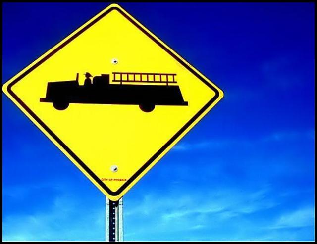
Taken at mid day on the highway! Nearly got run over! See what I do for DPC?
This is right on the highway, next to a road which leads to a huge fire station. I altered the levels in the sky to darken them a bit, and cropped the road out.
Statistics
Place: 42 out of 174 Avg (all users): 5.8090 Avg (commenters): 6.7083 Avg (participants): 5.6607 Avg (non-participants): 6.0000 Views since voting: 2033 Votes: 199 Comments: 31 Favorites: 0
HEY! I gave this an 8. I love the colors. Biggest complaint is that it goes off the left side of the frame. I like that it isnt centered but it should all be inside the shot. It's a cute sign. Very simple shot but it works for me. Yellow & Blue are Sweden's colors and my bf is swedish so ... :D
Use the full file size!! There's no reason not to, and make sure that you don't repeatedly save as jpg or you will get more artifacting b/c it loses info every time you save. Save as something else until you're all done editing. (you might know that but anyway)
The composition, and color make it a very striking image. Perhaps a little blood...just kidding. The point of view also helps the image...The low score???? I can only guess that it was because the image is very flat and gives little depth of field. Perhaps a catchier title might have helped. Although a 5.8 isn't that bad of score. Good luck on your next challenges. JG
It's amazing. I couldn't see all the artifacting on my other computer! I'm on the laptop now, and it's so evident... maybe I should check on both from now on :p
was one of my faves. unique sign. great results with that camera too!
It's true! She discovered Neatimage and how to use the levels adjustment in the Gimp while processing this photo (from conversations with me and puppet10). I'm so proud... and jealous! :P
Very nice colour saturation. I don't understand the placement of the sign, seems too close to the bordres. Might have worked better in portrait mode and centered. Still a beautifull photo because of the colours. 8 Jacko. .
that blue really works well with the bright yellow, it isn't a very interesting sign, and i think it would have been better with less of the post in the picture
i like how the detail is so strong that i can read the city in the small type, but at least on my screen there seems to be some contrast problems along the edge of the sign vs. the sky, esp. on the upper side.
Excellent color in this one. I like the composition quite a bit. My only criticism would be the jpeg compression is very evident here, as the image is only 30k, and you are allowed 150k. 6






 Add photograph to your favorites
 Add photographer to your favorites

 Photographer found comment helpful.


