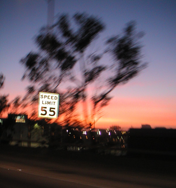
Composition - Great composition overall. The thing that I like most about this is the placement of the white sign on the tree background. This works extremely well. It makes the sign jump off the picture like it was PS'ed on there. Outstanding. The slight (or a little more than slight) also makes even more contrast to the sign. Everything about this picture puts the attention to the sign, which is what I'm assuming you had intended to do. The sky color is terrific. The only thing that is mildly distracting to the sign are the couple of bright lights next to it. But what can you do? Also I think it would've helped a little if the sign were at a right angle with the horizon. Overall, this is well done.
Photography - You hit the exposure on the head. It is as well done as I think it could be. The DOF is hard to judge due to the motion blur, so we'll say that's well done too. You've performed the panning technique very well IMO. Outstanding
Processing - This photo could've used a little rotation to make the sign level to the horizon. You probably could've saturated the colors a bit more and still made it look authentic. It by no means needs the colors done. Squaring the sign up would've made the most dramatic change to this pic, and for the better.
Overall - This is a very well done pic. A couple of minor adjustments and I think it would've reflected in the score. This photo is very underrated in my opinion mostly because the viewers don't like to see blur in the photos. Sometimes we intend it to be that way and I think that it can easily be recognized by this photo that it is very intentional. Excellent pic. It was a fun one to critique. Thanks for sharing it with DPC! - Bob
Odd, yet cool. It's interesting how you got the Speed sign frozen very well, but blurred the background. Nicely done! Too bad the blur takes a little away from the great color of the sunset (no points). 8 Swash
Nicely done. I like the colors, and you have a great effect here. I think rotating/tilting it slightly to the left, to even the sign up, would have helped some.
Pretty creative! You should have tried to get closer to the sign somehow without losing the trees. Should have rotated the picture several degrees to the left also.






 Add photograph to your favorites
 Add photographer to your favorites


 Photographer found comment helpful.


