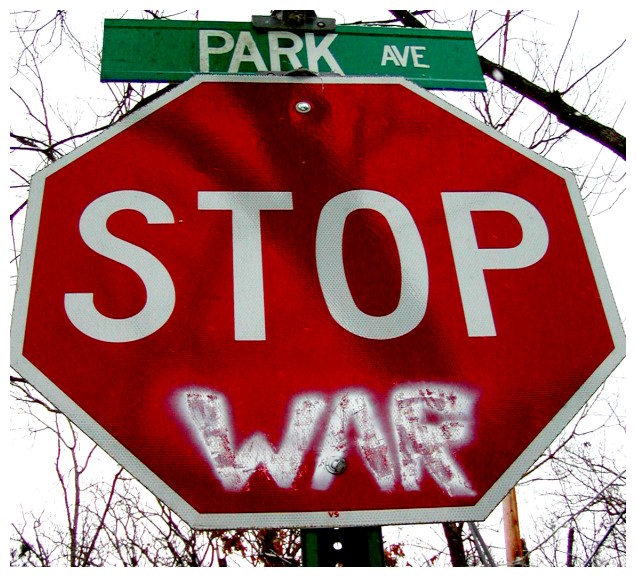
Thanks for your comment, and I'm glad you liked the presentation here. I actually thought the chaotic background and the sharp red of the sign would effectively sort of slap the viewer in the face, but I think that may not have been the right tactic for a voting competition.
Your presentation of this is well done! I love the Park AVE above the stop sign. Really tells a lot about American culture. This photo reminds me of the peace rallies during Vietnam. You captured the same journalistic feel as you'd see on the front page of the newspaper. If you were going for a 'perfect' look then I would have all kinds of suggestions, but if I take it into context of the message being displayed, there isn't really much to add.
You have a good eye to capture this. Your presentation is minimal but effective. I really makes me think!
Too tightly cropped to the edge of the sign, a couple of the points of the octagon have been cut off. You may also have had a raindrop land on your lens (there seems to be a strange white spot on the branch in the top right corner).
My overall impression of this shot is so, so. The sign itself is very interesting and I like the upward angle you used, but I think you oversaturated the red too much. All the tree branches and the telephome post have red in them, the sign looks all pixely because of this also. The shadow on the sign is also a bit distracting. I cant figure if you are trying to make a statement with the over saturation about the red=blood. I guess either way it really didn't work for me. 3.





 Add photograph to your favorites
 Add photographer to your favorites


 Photographer found comment helpful.


