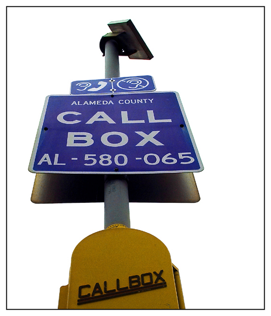
How did you get the beautiful colors, good focus, and the completely white background unless you put a white posterboard behind it. But that doesn't appear to be the case. Well done. Like the boarder. Nice one for a 7.
Effectively removing the background really brings attention to the sign. To me it feels that cropping part of the callbox was a bad move - could you perhaps have taken the photo from lower down to include all of it? Other than that the focus is pretty good. The border is also nice and simple.
Something misses here for me, which is frustrating, because it has most of the elements of a good photograph, to me. Maybe it's the letdown of the yellow on the callbox itself. I'll update if I can think of it. 6






 Add photograph to your favorites
 Add photographer to your favorites


 Photographer found comment helpful.


