Thank you all for taking your time to comment on this!
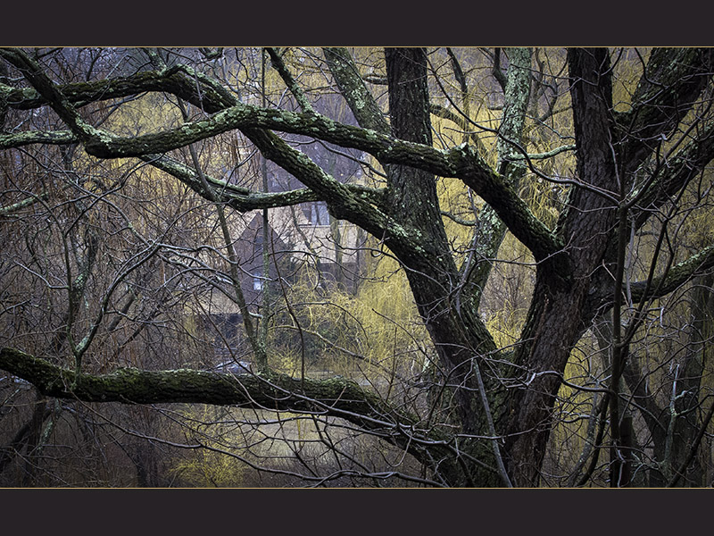
Seems that adding the border was a mistake, or at least making it this color (maybe black would have been less distracting). I submitted it first without it, "au naturel", but really did not like the long narrow proportions.. Did not want to crop left or right, could not add top (sky) or bottom (BIG power lines). Was to lazy to get out of the house in the rain to shoot something else (took this one from the balcony)....Sigh...
Do you really think it looks better without the border?
Statistics
Place: 18 out of 64 Avg (all users): 6.2079 Avg (commenters): 7.4545 Avg (participants): 5.8372 Avg (non-participants): 6.4828 Views since voting: 501 Views during voting: 248 Votes: 101 Comments: 13 Favorites: 0
I think this image is quite effective especially with an unexpected palette, sensitively detailed composition, and well managed deep focus technique. But to my eye those bars ruin it (never to be seen in a gallery so why here?) It's a 7 quality shot but please rethink using the bars in the future. Why destroy an otherwise beautiful presentation? 5.5 (which way should I round?) Ok 6.






 Add photograph to your favorites
 Add photographer to your favorites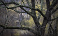


 Photographer found comment helpful.


