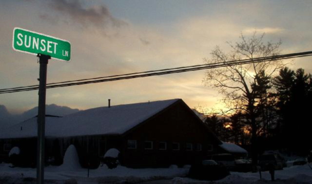
i think if you had boosted the saturation on this or played with levels you could really have made that sunset pop and played on your title a whole lot more dramatically! :)
Well done in terms of having the sign bright when the house is dark. The focus just isn't there like it should be. The pic is a bit too dark overall. The powerlines are really strong in the pic. The sun is down just a bit too much. It would've made the exposure better I think - Inspzil
Neat idea! Too bad about the overhead wires, they're everywhere. The street sign seems less than fully crisp and the flash didn't light it up evenly. 6 Swash
This could have been a winner. Nice photo of a play on words. But it needs to be much sharper. Much too soft focus for me personally. Good composition just need much better execution. It's a 5 mainly for the sunset and sign.





 Add photograph to your favorites
 Add photographer to your favorites

 Photographer found comment helpful.


