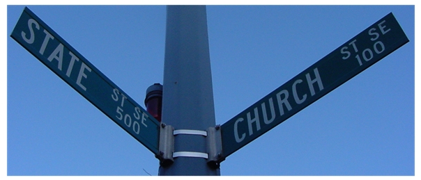
Composition/Content: Great observation of this contradiction. I wonder what the rest of the intersection looks like and whether including it would improve the image. I think the image would look better without the border.
Lighting: The image is a little dark.
Camera Work/Technical: I like the angle you took the image from. The focus is good but the exposure could be a little longer.
Digital Processing: I copied the image to see if adjusting the histogram would help the brightness and it did. I also did a little color adjustment to bring out the green and it also helped the image.
My Opinion: I think you found a great subject that fits the challenge well. A little post processing would have made it a much more attractive image with brightness and color. Backing off or not cropping quite so tightly would also have improved the image. Nice job.
Very cool find, I just love the title. Your focus is good, but color wise, there is just too much blue in this shot. Where is the green of the signs? The color contrast of blue/green or even white/green would also help the signs stand out a bit more. I also might have tried to approach this shot at a different angle if at all possible. Due to the fact of having to read both signs I would have tried to get the post dead center in the shot, or if you cropped some include a bit more sky on the state side, give the shot a sense of balance. 7.
Nice composition. I'm curious as to why you chose such a bright border around a fairly dark image. The focus is very crisp, which makes the writing easy to read and the balance of the signs is good.





 Add photograph to your favorites
 Add photographer to your favorites

 Photographer found comment helpful.


