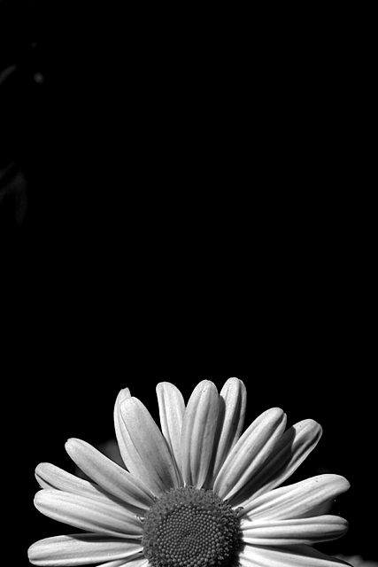
Great composition and cropping here. Too bad there's no spot editing allowed, becase the mark in the top left corner is completely distracting for me. Otherwise I would consider this a top 20 photo.
The grey elements at the top left distract from the picture, but other than that a very well composed b&w. I especially like that the negative space at the top 2/3rds focuses the eye on the flower.
Very cute concept. In this case tha b/w (which looks good) dies not lend the petal the delicate rendition of the perals. I am certain you probably wrestled with color versud b/w. Despite my comment, you nevertheless have an attractive entranr here.
Overall a very nice picture. But I think a solid black bacground might have worked better. The bit that is there is a distraction, and just seems odd to me.
Looks a little like sunrise or sunset, doesn't it. I might have cropped a bit from the top to get rid of that artifact in the upper left, but that is 'nit picking' as it is a very nice image.






 Add photograph to your favorites
 Add photographer to your favorites


