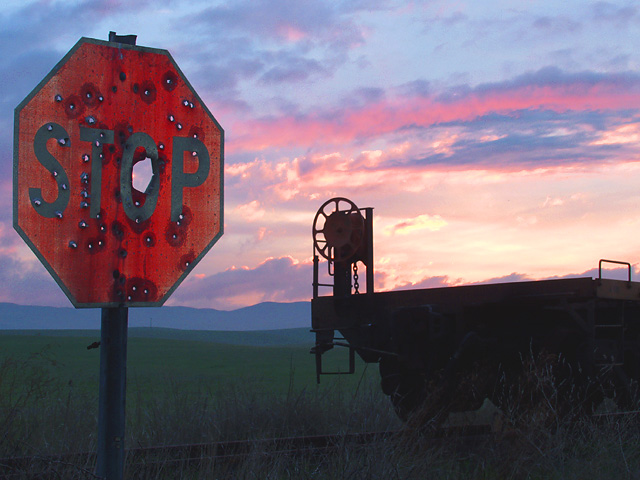
Rural stop sign in the Tracy,CA area. I had to shoot it and wanted some color in the otherwise cloudy and foggy sky. I waited 2 hours for a sunset and this is all I got. I used a reduced flash for fill on the sign to keep it from being too dark due to the sun's position. I took the shot with the rail car in it to give the stop sign a purpose as I thought just the sign by itself didn't give the shot any story.
Statistics
Place: 3 out of 174 Avg (all users): 7.0995 Avg (commenters): 7.8125 Avg (participants): 7.0089 Avg (non-participants): 7.2135 Views since voting: 5988 Votes: 201 Comments: 43 Favorites: 10 (view)
John,
What a very nice constructive critique. Yep, it sure looks like I got my shutter and aperature twisted around. I will watch for this in future. As you have done I took many pictures during my wait, but what is ironic this particular shot is one of the ones I hoped would have everything I had tried to get. It did except on some of the others the stop sign was better lit but they didn't have any color in the sky. I had found the sign a few days earlier so I had a good idea what I would try to get as soon as I saw the challenge. This time it played right into my hand.
Thanks to you and all of the volunteers on the CC, you are doing a commendable job. I have on several occasions almost offered to help out but I just don't feel confident enough to be of real assistance to someone else.
Thanks again,keep shootin' and have fun!
Dick
Congrats on a great finish with this photo... I think you have a very strong composition here. You are right about the railcar in this shot. I believe that it definitely adds perspective to the entire composition. It would be a little boring without it IMO. I also think the extreme left composition of the stop sign works very well here also..
"Waiting" for the right shot is always fun :) Especially with a sunset... the color and composition of it is constantly changing and you knever know what you will end up with. I have often shot 30-40 frames of the same composition in a sunset in order to have a good selection to choose from when I'm finished.
I don't know if there is much room for improvement on this image. The only thing I would have possibly tried with this setting would have been to underexpose a few shots. (I think you reversed your aperture and shutter in the settings here) I would have tried the same composition at 1/20, 1/40, and 1/80 with the flash also. Each stop down would have darkened the sky (and the foreground) a bit more, but it could have punched up the color in the stopsign with the flash as well... I think the only complaint I have with this shot is that there is not enough contrast between the color of the stopsign and the sky to really make it stand out as much.
The bullet holes in the stop sigh are great! I actually looked for some signs with these holes in them but I did not find any around here... There used to be plenty of them but I suppose my community has gotten away from the 'fun with firearms' lately :)
It looks as though Tracy's surrounding countryside has helped me out again. Since participating on DPC I have learned to always be on the lookout for material to use for better photographs. Thanks DPC for opening my eyes to what is around me, for many years I took the environment for granted and now I use the hell out of it.
I had a great deal of difficulty finding a title for this subject and I appologize if anyone might have thought it was not appropriate. Thanks Drew for making such a wonderful shot of a most pristine stop sign a year ago. Mine seemed to be an exact opposite so hence, the comparison. My feelings about my sign were that even though it was yelling STOP!, the shooter who had the word stop engraved in his sights, went ahead and shot anyway. It is kind of a reflection of our current society.
To all of you that enjoyed this shot and made such wonderful comments I sincerely thank you, your comments mean so much to me. Okay lets all go out and have some more fun.
Dick
Hey! I'm Drew!! I'm flattered at the very least. Beautiful colors. I love how you bring out the texture in the stop sign, and how well that contrasts the reflections that made my shot. Great job, and congrats on 3rd. :)
We can only hope that Drew hasn't taken the same turn for the worse!! Nice job, I wish the sign was just a bit brighter even at the expense of the sky.
Brilliant work. You've balanced the exposure between the sign and the sky perfectly, and the wheel on the flatcar is a nice counterpoint to the sign. I generally dislike square crops, but I think this would be even better with the R side cropped away.
I really like the colors in the sky, and how the details of the sign shows, bu the thing (a railroad car or something) is almost silhouetted. It sets up a nice contrast. Good humor, as well.
Wow. A lot of hunter's don't like stop signs around here! Beautiful Colors in the sky, nice blue on the mountains in the background, nice red on the stop sign with the [rust] bullet holes. the flatbed on the right really makes a fine finish to this photo, nice job, well done.
Another first class image in my books. The bullet holes, broody landscape, railcar slihouette all speak together of desolation. The pink clouds and light red sign compliment each other. As do the sign shape and "wheel" . There is not much in the way of texture in this foto. And to me, that permits the visual elements that are present to have more punch in terms of shape. And variety of shape (with a few color accents) is what seems to essentaily pull this whole picture together. A truly wonderful image easily achieving top ten status this week.
This is a very picturesque photo - a lovely sunset, a silohuetted rail car and a stop sign that's obviously been target practice once or twice. Colours are great, focus is perfect and composition is wonderful. Well done - one of the best.
The "title" of the picture is 50% of picture in this challenge (in my opinion), and I can't believe the TERRIBLE titles I've seen on great pictures!! :) You should have used "The Most Unpopular Stop Sign in the USA". Or "Residents Petition to Have Stop Sign Removed". You'd get a 10 with a good title, but a 7 with this title. Very nice picture, BTW. :)
This photograph is very appealing to me. I like the way the mood is evoked by the sky, and then the stop sign with all the bullet holes in it. It just looks so out of place, it's amazing! 8! -Annida
This is just too funny for words! Though quoting Drew's sign revisited I may have gone more with a close up of the sign. Drew's was a very close shot. The scenery and railroad car? are beautiful, but detract away from the sign. Also, I woul dhave left a bit more space left of the sign, it is cropped just a tad too close for my liking. Overall, I just loved this shot.8.
this photo says it all. the beauty and vastness of nature against the efforts of humanity to create order on this earth, only to ultimately fail. also, a portrait of the nature of rural life - great beauty mixed with isolation and decay. even our monuments, like us, eventually return to where they came from. 10.
Kind of depressing, I wonder what happened here. I think this would have worked a little better with less space cropped on the left or a little more on top, just so they were about evenly spaced.





 Drew's Stop Sign Revisited
 Add photograph to your favorites
 Add photographer to your favorites

 Photographer found comment helpful.


