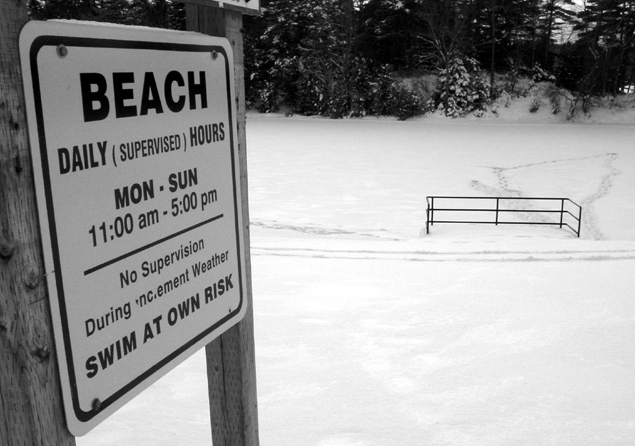
Im no critic. Not a qualified one anyway. 'the snow isnt too white', 'good tones', etc. No clue what all this means. If its pleasing or intriguing, then i check out the pic. The title got me on this one. Very clever! I read one comment where they didnt get it, or was that a joke its self? What Im getting at here is the fact that the (pun) part couldve been omitted to make a more effective title. I mean we're all pretty smart, right? Otherwise, this is a great pic. Good cropping.... hahaha
Funny, look slike my back yard (sighs). I think you cropped the sign a bit too much on the left, though I do enjoy the angle. Black and white for this shot was a very good choice, there is not much color in this shot anyways, and it really helps the contrast with the white snow. The lighting is OK, and the white of the snow is not too bright :) 7.
No one wanted to swim at their own risk? For shame. The is a great photo. Is the lower part the swimming area? I'm jealous of the snow. You did a great job on this and picked a good sign to use. Nice job. Worth an 8
Nice perspective on the sign - it helps show the "inclement weather" in the area. Was the photo really more effective in black and white than colour? I guess it adds to the coldness aspect somewhat. Focus is very good and the image is quite easy to look at.






 Add photograph to your favorites
 Add photographer to your favorites


