|
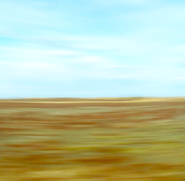
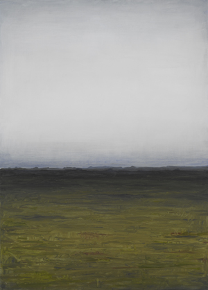
I really, really like the blur and the colors, but with the horizontal blur, I'm not sure that square is the best format -- I think it needs to be more of a horizontal rectangle. Also, the division between the blue and the yellowish areas is, IMNSHO, a little too 50-50. I'm not saying be a slave to the Rule of thirds, but I'd like the division to be more asymmetrical. My opinion is worth exactly what you're paying for it. Good shot. |






 Add photograph to your favorites
 Add photographer to your favorites


 Photographer found comment helpful.

