|
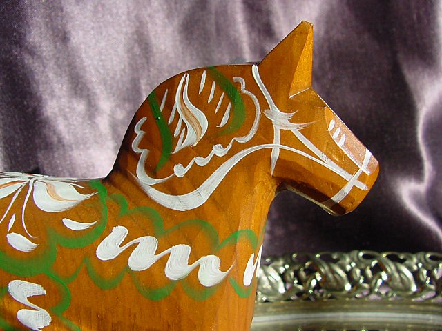
Good lighting and sharpness on the foreground element. What is letting you down here is your background. The creases dont really help and it looks like the type of fabric that reflects light, and the color doesnt really compliment the subject either. A plain solid color would have put the emphasis on the wooden horse and kept down a lot of the distractions. |





 Add photograph to your favorites
 Add photographer to your favorites


 Photographer found comment helpful.

