Hello - Greetings from the critique club. Funny thing, I usually draw a few pictures at a time so I can mull them over for a day or so. One week I got all train station pictures and this week I have all baby pictures. Good thing I like babies more than I like trains.
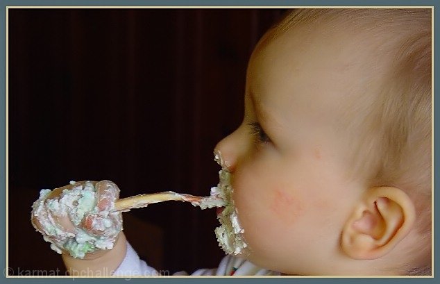
First, I have to ask. What is that stuff??? It really doesn't look edible to me!!
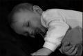
Usually, as I look at a picture over and over again, I like it better and better, Unfortunately this is one I like less. It just doesn't have any spark to it. I know your work and I know you can do much better with lighting and composition. This is the same fellow with the sparkle in his eye in the "Spoon Fed" picture so I know that he is much cuter than this.
What's wrong? Okay it's funny...and it's messy..and it's cute. So why isn't it wonderful? Maybe because no one looks happy? A happy baby is absolutely contagious and I don't get that feeling here. I wonder if you added a tiny highlight to his eye if it might make all the difference in the world? Everything seems sort of flat. His expression is flat. The colors are sort of dull. The soft focus, though very well done adds to the dullness.
Your composition is nice at first glance. The hand on the left, balances the kid on the right and the spoon connects the two weighted areas. The hand is great and in it's "thirds" position but the complimentary spot should be the eye, that lack-luster eye. So instead my viewers eye travels down to the ear which is the second most interesting thing in the picture but seems irrrelevent to the story.
Technically (this is my weak point) it is lovely, The soft focus is lovely but seems unsuited for the occasion, it would be nice if he were sleeping or cuddling. I like that the kid is soft and the goo is sharp. Is it too sharp? around his mouth it looks like cement. The use of the uncluttered background in nice. And the choice to leave out any distractions, like tray or bowl or Mom is nice. Would it have looked better in black and white? Maybe the white balance is wrong, maybe that;s why the colors seem so uninteresting.
I'm so sorry to be so harsh because I'm hitting below the belt twice, critisizing your photography AND your baby. Yikes! I should be banned from the site. The problem is that I think you can do much better.
Didn't have to do any special setting up on this one, did you? This is so cute and funny if it's not your kid. I hate cleaning them up. Hope this one gets it. Great photo and so funny. Like the black background. At first didn't like the cropping, but now really like it. Good job.
Great pict. But I\'m suprised alot of people for this challenge elected to go with black as thier backgorund, black is\'nt that funny. Anyway the 2 comment I have on this pict is, yes the black back takes away from the humor, and I would have prefered a different angle on the cutie. One that would show more of the face looking at the camera. Good luck.
Well, almost. hehe. I have a 2 year old, but he doesn't like to get ANYTHING on his hands or face. He totally freaks out. Always has, so he was a really neat eater. I wish I had some pics like this. lol I love the angle, and the background is perfect. focus and clarity are great. Color is also good. Definately made me smile! Good luck in the challenge.





 Add photograph to your favorites
 Add photographer to your favorites


 Photographer found comment helpful.


