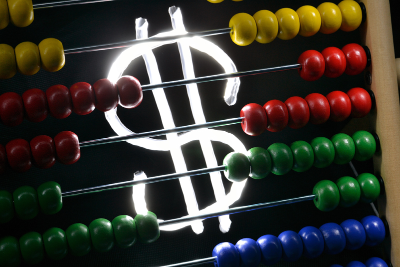
Nice justoposition. I wonder if B&W would be a more powerful image. THe colors ae so bold that the dollar sign is not the visually intersting. Also reducing the front light to put more shadows and empasize the backlighting would be worth trying as well
Clever idea. I think this could have been served well to have a bit more even light on the abacus. Right now, the left side is very dark, and there are some harsh shadows on the right side.





 Add photograph to your favorites
 Add photographer to your favorites


 Photographer found comment helpful.


