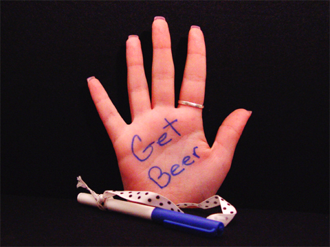
Composition/Content: Very funny image. The simplicity gives the image it's impact. It's also funny that a redneck would have to write down such a note. I think the rectangle works great being a natural photo shape, it helps the subject stand out and be the center of attention. The angle of the writing also brings the eye straight to the message. Using a woman's hand makes it even funnier. The ribbon adds to the picture in that is represents to me that this redneck doesn't want to lose the pen either. Nice shot.
Lighting: Good lighting.
Background: Good choice in background as it accentuates the subject.
Camera Work/Technical: Good exposure. The soft focus could have been a little sharper but doesn't distract from the image very much.
Digital Processing: The image could benefit from some jpeg artifact removal. It would also make the reddish shadows look better.
My Opinion: This image could easily be a commercial for a beer company. Very creative and well done.
This is my favorite submission for the humor challenge. Nice job... it definitely got your point across while at the same time managing to be a very nice photo. I especially like the fact that you used a woman's hand for the photo, I think it adds to it :-) The lighting on here is excellent, and I like your choice of centering and horizontal photo, I think the black space really helps draw your eyes to the hand. Excellent job! Good luck! -10-
This is just too hilarious! Both my husband and I laughed for quite a while over this one! Your lighting is good, but I would have liked a more daring/dynamic composition. The "palm pilot" is almost overwhelmed by all that negative space.
So.......what's so funny about this? We had the palm pilot first. I love this one. And you are right about us rednecks. God made hands before paper. Good one. I like it. From one redneck to another....congratulats
very funny...
on the technical end could be a drop sharper, and a little less red.I think I might have done a vertical shot.
quite original non the less!
Your in my top three.
I really love the humor here. It's not fancy, but it's a hoot. The ribbon and pen are a little soft. I think your focus could of been improved. Still the funny factor out weighs the soft focus for me. Good color, light, background.
Really good idea. The composition is quite centered, but in this case I think it works well. To improve it I think you should have used string instead of ribbon to tie the pen on, because the pattern of the ribbon and the way it twists is quite busy, taking away from the hand in my opinion. Still, one of the best I think :)
ok, this is very funny. The redness of the hand though is a bit odd to me. I think that the angle and framing/cropping is nice, and the focus and clarity are great. I like the background very much, totally black, nothing distracting. No distracting shadows or bright spots. I guess my only suggestion is to tone down the red. Good luck in the challenge.





 Add photograph to your favorites
 Add photographer to your favorites

 Photographer found comment helpful.


