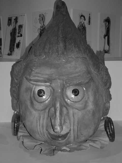
You got a real high self asteem, don't change a thing. Your pic looks a littl low on contrast and for a portrait the guys on the wall do clash with the main subject. 6
Not sure about this one...Shadows are a bit harsh on the left side. The flash is slightly harsh in the eyes. A deeper DOF would make the nose stand out less.
Kill it before it multiplies!! Haha! Just kidding. I think the camera flash casts a harsh shadow on the wall behind it and a harsh reflection in the eyes. I don't think the black and white works well here... I'll bet this looks better in color. And the drawings back there are a little distracting.
Without looking at the title, I thought this shot was technically well-done, but another shot of something mildly humorous without really making me laugh. Then I saw the title, and it all came together =D My one suggestion would be to try some different flashes, as the top gets darker and loses my attention.
This is pretty cute. Got a chuckle out of me. I like the angle and framing/cropping, but I think that it needs more whites. Black and white is good, but I think it's too grey. Focus and clarity are really good. Lighting is also good, but up the white levels, that's my only complaint. Cute shot. Good luck in the challenge.





 Add photograph to your favorites
 Add photographer to your favorites


 Photographer found comment helpful.


