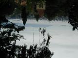
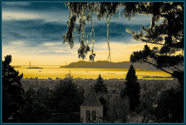
Tritone using Black, yellow, and cyan. Shot from the Claremont Canyon Regional Preserve in the Berkeley/Oakland Hills.
Composed upside-down with the camera mounted on the bottom of my tripod to achieve a low-angle under the branches.
Statistics
Place: 100 out of 219 Avg (all users): 5.5745 Avg (commenters): 6.2500 Avg (participants): 5.4179 Avg (non-participants): 5.7822 Views since voting: 2847 Votes: 235 Comments: 40 Favorites: 6 (view)
When I see photos like this my first reaction is "Must be nice to live in such a photogenic place", but then I remember I DO live in a photogenic place!
Maybe someday I will learn to take advantage of the surroundings as well as you!
I think it is perfect just the way it is. I really liked your shot. The colors and lighting are very unique which makes this photo stand out amongst the rest. I really like the church or building that is in the lower half. The tree is awesome the way it hangs like that. Your photo really has a lot of depth.
Thanks everyone for your comments. I figured that this was one people would either really like or not, but I was pleasantly surprised that so many of you liked it quite so well!
jimmyn4 -- Thanks for your comments and suggestions. The fringing around the upper leaves is totally an artifact of the tritone curves used, and represented the best compromise I could find. There's no sharpening applied at all. Maybe I'll try cropping off the tower walls -- I think the roofline will then mirror the triangular trees, and it will give it a overall more panoramic aspect.
It was somewhat a last-minute desperation shot -- there was rain and gray skies here all week, and I had little contrast to work with as shot, leading to my decision to artificially colorize it. Here is a link to the Original Frame (it really was shot upside down!)
Greetings from the Critique Club.
First off, what a splendid photo. I like the colors. It almost makes this place look like a different world. I think what you did here was very cool. I can understand why this photo didn't place well. I think mostly because it is different. I like the branches hanging down in the shot but whether you did it intentionally or not the outlines around them are very distracting and makes it look a little over edited.
I have never taken a photo with this technique so I can't tell you ways in improving this photo in those terms.
The composition is nice. I don't like the building in the bottom center. I don't mind the buildings and bridge furthur away but I don't like that building there. I think I would have wanted more of a seperation between the city and nature.
I found this photo difficult to critique so forgive me if its not the bext one ever. Good work and good luck in future challenges.
I am suprised this didnt do much better.It obviously didnt appeal to the tastes of the general group of viewers. The votes are so spread out , and the amount of low scores is near the amount of highest scores, mine being one of the 10's. Those that voted you down have no artistic sense about them and are loser's ! Great Job !
I adore this picture, it looks like it is more of a 3d piece of artwork. I'd love to find out how you did this. I cannot really fault it in any way. My favourite part is the branches of the tree hanging down, and the light reflects off it. *drools* This is a 10!!!! thanks for submitting it :) -Annida
This is such a beautiful shot but it seems too unatural. The moss in the foreground looks oversharpened because of the color. I would like to see the original out of the camera.
Very spooky. Armageddon or what? The use of complimentary blue and yellow hues is interesting. An unusual but dramatic color choice for water. The steeple piercing the bottom centre also has real kinetic thrust. This is an arresting diversion from a theme that could be plauged by calendar attempts. Thank you for venturing so creatively. A good image.
Bizarre coloration, but cool! The clouds came out a little grainy and the tree in the foreground looks to be over sharpened, but the overall effect is just a little too cool to berate it too much. (Special filter?) Very, very cool! 9 Swash (I just had to take away a point for the above issues, sorry)
I think it's processed too much to perhaps make the water appear golden. I think people should strive for their photos to appear natural rather than super up in photoshop too much.
This looks unnatural and more like a painting then a photograph. I really don't care for whatever you did, I'm guessing in photoshop or a similar program. This would have been a really cool photo just in black and white, not sure why you choose to do such dramatifc stuff with the coloring. Just having the piece of the stteple is kind of bothersome, but I love your framing of this shot.
The effect that you tried with altering the colors was inneffective. A more natural colouring would be in order. I liked the overhanging tree framing the shot. jgillard4
I found it difficult to catch the bridge sue to the smog, good job, but you almost loose the reality of it in the tree hanging over the top..Overall good shot..






 Add photograph to your favorites
 Add photographer to your favorites

 Photographer found comment helpful.