Author Thread Comments Made During the Challenge
Post actions
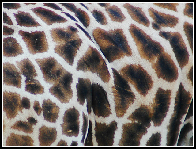
Nice color and interesting, but for me, has a "wallpapery" feel to it. Would love to have seen more of the giraffe's "personality"!
Post actions
A bit more of the giraffe and some context/background would have made this a considerably stronger challenge entry.
Post actions
this would probably be more interesting to me if the focus was a little sharper. i also don't think the border does anything for the presentation.
Post actions
Focuse and colors could wish better but idea is nice of showing texture.
Post actions
Great abstract idea but I don't think the colours are rich enough to do it full justice.
Post actions
Unusual perspective of a Giraffe, well done. The frame compliments it.
Post actions
I being with a haiku:
Post actions
Very cool! I like this a lot, a nice design with great composition! The only thing is its a tad bright on my monitor, and maybe a bit blurry. 8
Post actions
Interesting texture but it says nothing about its environment to me.
Post actions
Interesting perspective. The image seems flat. I'm trying to think of how you could have given it more oomph but I have a brain cramp right now. Stay tuned ... Jacko.
Post actions
Nicely composed and producted shot. The border holds the shot together well, and good choice of just b&w for the border not colours. The black parts of the spots look a little pale. I think I'd increase the contrast or levels a ltitle. The shot looks a little soft - I think I'd try using a little (more) sharpening. With the texture as it is I'd imagine it would be hard to see any negative effect of the sharpening. Overall interesting idea and pretty well produced.





 Add photograph to your favorites
 Add photographer to your favorites


 Photographer found comment helpful.


