Thanks to those who enjoyed the image, and for those who took the time to vote.
I don't think I will ever look back on this image as one of my better photographs, but it seems to me it meets the spirit of the original Where's Waldo books which often had little figures throughout the photographs. My "Waldo" (extreme left, six stories down from the top) is the only human clearly visible in the final image. (Two women were visible about 9 stories below the crop, but their lanai was not included in the final image.)
As far as the request to upload the original image, I have no idea how to accomplish that as it is a large RAW file and DPC stopped me from loading it when I tried.
@Alan: The lanai you mentioned (3 up from the bottom) does not contain people. It looks like some lights behind a drawn curtain on the right side of the lanai and a bright spot on what looks like the edge of a mattress.)
Even with the original photo it is hard to make out anything other than TV screens and lamps inside any of the rooms. Just as well, I'd say.
I got a kick out of Neat's comment about fires in the rooms. I agree, that I overdid the saturation. I made that decision in part to give Waldo some competition on otherwise vacant lanais, because I thought he stood out too much with a more conventional saturation. Judging by the "sightings" of other people, maybe I succeeded too well in that effort.
Statistics
Place: 1 out of 45 Avg (all users): 6.8545 Avg (commenters): 7.0000 Avg (participants): 6.2400 Avg (non-participants): 7.0353 Views since voting: 3479 Views during voting: 275 Votes: 110 Comments: 18 Favorites: 2 (view)
I see the obvious one on the left side 6 down, but I think I see 2-3 people right center 3 up from bottom. Maybe Jeff will confirm with full sized image.
I love this kind of straight lines architecture shots. And even if I'm sure there could be other people in the photo, there's only one clearly visible!
Cool location for Waldo. I really like the graphic nature.
The border merges with the black areas on the edge of the frame and thus detracts rather than helps your image. It is also wider than the internal white columns and becomes part of the graphic rather than accenting it. Either a thin line white border or no border would have worked better.





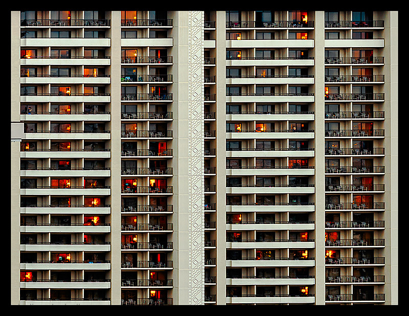
 Waldo at the Hilton
 Add photograph to your favorites
 Add photographer to your favorites

 Photographer found comment helpful.


