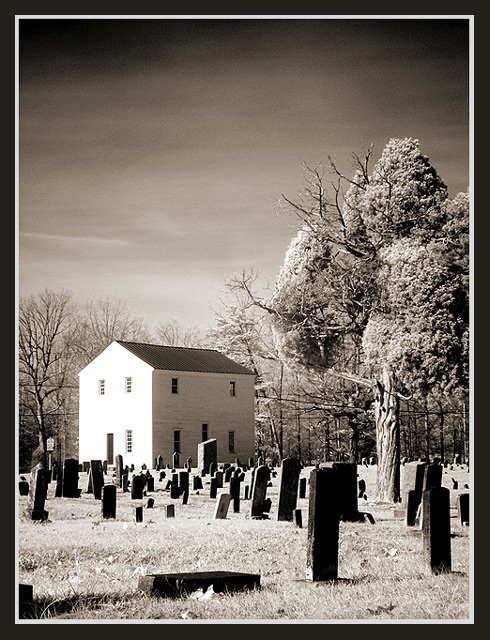
This is Old St. Paul's Lutheran Church in Newton, North Carolina. This graveyard has tombstones dating back into the 1700s. I shot this image with a Hoya R72 Infrared filter.
Statistics
Place: 18 out of 219 Avg (all users): 6.6446 Avg (commenters): 7.5405 Avg (participants): 6.4296 Avg (non-participants): 6.9159 Views since voting: 2974 Votes: 242 Comments: 41 Favorites: 6 (view)
Hello John, greetings from the Critique Club (I guess you heard about it ;-))
Composition:
A bit uneasy. There are lotss of details to see. Outdoor photos can be very cluttered sometimes but you did a good job to handle it. There are three elements: the tombstones, the house and the tree. The house gets a bit more attention because of the lighting but generally all three elements seem to play an equal role. So your composition was used well to capture the overall mood of the while scene.
My personal preference is that I like simple photos more and I think the photo would still look good without either the tree or the house. But I'm unsure if it would look better, because house and tree balance each other well.
Two "mergers" distract a little bit. First, the tree does not contrast very much against the trees in the background. The colour tones are the same and because if the wide DOF both have the same level of detail. Second there are two tombstones which merge because they're both black and there is no edge.
Lighting:
I like the infrared lighting and the high contrast very much. It's very stange and interesting. Black and white suits the overall theme.
Unfortunately the lighting looks a bit too sunny and happy, which does not fit to the theme "dead of winter". The blown out wall of the house, the high contrast and the bright grass makes you think it's sunny and you expect shadows. But there are none (at least I can't see them) and this makes you think it's (a hot summer) noon.
What I like most in this photo is the gradient in the sky. It's has such an awesome eerie feeling! Very moody and dark. This really "makes" the photo in my opinion.
Focus:
I like the DOF. Good decision to use the narrow aperture and accept the resulting slow shutter speed. The focus is great especially for such a slow shutter speed.
Postprocessing:
I removed the border in my image editor and I like it better without it. It "constricts" (warning: looked word up in dictionary, hope it fits) the photo and without it the photo is more "open" which fits much more to an outdoor landscape photo. But I'm no broder-expert and very rarely like borders.
Art:
Not a typical landscape photo (which is a plus!), but in my opinion you met the challenge topic. Creative use of infrared lighting. It transports an interesting mood and has an appealing strangeness. The title fits although the "winter" part is not very visible (as explained above).
Ok, that's it. I hope I was able to express my thoughts about your photo correctly (which is a bit difficult sometimes, especially because English is not my native language). If you have questions, please don't hesitate to email me.
This is a very interesting image. The sky is incredible. It's also a very creative take on the challenge and the name is also good. Photographically the only thing is the side of the building being a little hot but I think it has to be that way so we can see the backlit side. For a photo titled "Dead of Winter" this thing sure is alive. Nice work.
So far, this is my only 10! Your composition is really interesting. The rows of headstones brings your eye to the building, and the tree on the right adds balance. I like the wide range of tones from whites to blacks. The left wall of the house is a little blown, but spot editing rules prevent a better fix, so I won't count off for that. There are some power lines running horizontally behind the house that I find a little distracting, but once again, you can't do anything with that based on contest rules. I would clone them out for printing, though. Overall, a very nice image, well composed, nice balance of tones, good DOF. Well done!
JD Anderson
Upon further looking at this photo I see much more than I originally did. This is an excellent shot with a very emotional feel to it. The headstones in the forground tell the story of a part of history. The one on its side shows how easily we forget. The strength of the tree shows how we overcome the loss of loved ones, and the building in the back takes us back home. Your conversion to b/w is well done. My only negative is the left side of the building is washed out. I know that in order to have enough light for the darker surroundings you prolly metered for it, resulting in a brighter building. Excellent work!
Your photo is an excellent example of sepia colour IMO. I love how you have captured the 'age' of this. I also love the sky how it is not all one colour and it almost gives a sense of eerieness, which is usually felt at a grave yard. Well done and GL in this weeks challenge. 10 :)
Dual meaning. I like this a lot, and I think my only complaint is the white side of the building. It really doesn't fit with the photo. seems out of place. I realize you can't control something like that. But after the challenge, you could try dimming it with an editer or something. I really like the angle and framing/cropping you chose, and the border works very nicely as well. is this IR? I'm not real familiar with it, but from what I've seen, it has this kind of effect. Lovely location for a shot. Good luck in the challenge.
Wonderful photo. B&W really works, as does the border. The sky is great, as is the entire composition. Nothing negative to say about this actually. My only suggestion would be to remove the powerline (if that's not too much trouble for a free challenge photo) - but given that's my best suggestion you have done very well. Great job.
I like that shot. The front of the house is too overexposed (I guess it's IR). It could have been bright without being pure white in my opinion. 7. Lionel
Haunting image. I really like the contrast and composition. Cool cool tones. Is it IR? That bright white side of the building bothers me, but I love how the sky gradually fades.
I love this image. I don't care if poeple think this is landscape or not. If I had to catagorize it I would put it in Landscape. Where else would it be put??? Still Life? Architecture? Don't think so... Thanks for sharing....








 Add photograph to your favorites
 Add photographer to your favorites


