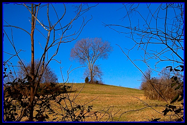
Challenge:Landscape (Classic Editing) Camera:Kodak DX3900 Location: A Pasture near my home. Date: Jan 10, 2003 Aperture: F 8 ISO: 100 Shutter: 1/512 Date Uploaded: Jan 12, 2003
Critique Club Comment by Grayce M. Dillon aka Gracious
The color of the sky is phenominal and contrasts beautifully with the warm-colored landscape. The single tree on the horizon is nicely framed by the foreground branches, which also adds depth.
having the whole image so centered makes it a little stagnant and predictable, but overall it is a lovely image and I like it.
I'd reconsider using a blue border. Black or white border would be better.
I don't like that border. I would change the blue one for a white one. The picture is good and I woun't rate it worse because of the border. Good job and good luck :)
Wo. Excellent, excellent sky colour. 2 things I'd change. 1 the blue border is very distracting. Maybe just use a black border. 2) shoudl have gone through the shrubs in front ... they're a bit distracting. This way you could have concentrated on the the wonderful tree in the middle. I'll still give you a 8 because it has that Wow element. Good luck.
The blue border hurts this one - it would have been better to stick with solid black or get the blue more closely matched to the sky. Nice framing, good detail and lovely photo otherwise. = 6
Nice but look oversharpened a lot it's very distracting. I am not sure the foreground branches bring to the picture.I mighthave preferedthe same shot just behing those branches.
I like the photo but I don't think the border suits it. The blue is too bright, especially around the bottom. Perhaps just straight black, or black with a white hairline inside it?
If you pull back and look at the thumbnail you can see where the brush or leaves in the lower left throw off the balance of this shot. Imagine though if evrything in this were symetrical , wow . that would be cool. I tried this too with mixed results, nature doesnt always give us a perfect canvas . But it is out there.
That is a nice shot and I like how it's framed by the branches. That blue border though is just too much. Maybe if you put the black border first, and then the blue it might be better. Having something that seperates the blue of the sky from the blue of the border. I don't mark down for borders, but something to think about anyway. The angle and framig/cropping are nice. I like the blue of the sky. A nice landscape. Good luck in the challenge.





 Add photograph to your favorites
 Add photographer to your favorites

 Photographer found comment helpful.


