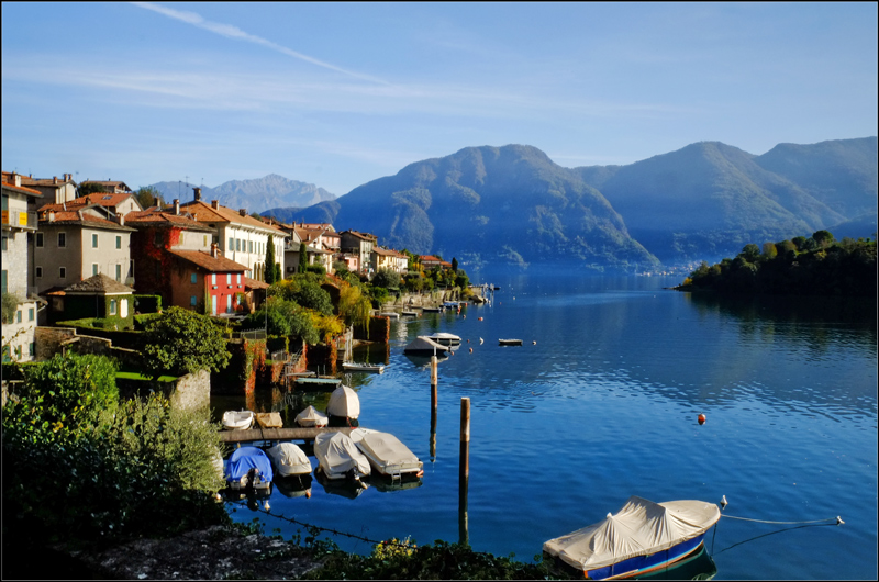
The composition is very pleasant, and you get the senseation of wanting to be there. Had the sky been darker and the mountain more "refined" in the post process it woulde've matched the color and quality of the water, and that would've been a 10. This is more an 8 to me.
I would've darkened the sky with curves and then used the blue curves channel and tweaked it to match the water. Then I would use two seperate curves channels on the mountain. One of them in screen blending mode, the other multiply. Invert the mask and brush with 5 - 10 % opacity brush where you want to enhance high lights (that screen) and shadows (multiply). The mountain should also be green, and this is more chilled, therefore not giving a good seperation between sky and water. Another curves layer where you play with the green channel would certainly green it up. When you use color channels on curves you might have to compensate with the other two channels. Often red and green go the same way, but the blue the opposite. |





 Add photograph to your favorites
 Add photographer to your favorites


 Photographer found comment helpful.


