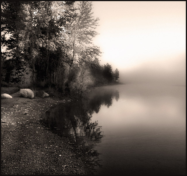
Shot early in the morning, just before sunrise, on a foggy morning. I had a lot of trouble deciding between the color or sepia version and finally decided on the sepia. Dodged and burned, glaussian blur added at about 5 or 10% opacity.
Statistics
Place: 13 out of 69 Avg (all users): 7.4888 Avg (commenters): 8.0133 Avg (participants): 7.0175 Avg (non-participants): 7.5669 Views since voting: 4802 Views during voting: 888 Votes: 401 Comments: 84 Favorites: 29 (view)
Something about the difference in sharpness and softness in this picture sits wrong with me. My eye is drawn to the right side of the picture, where there really isn't much for it to take hold of. This looks like a very tranquil scene, and the use of black and white is quite fitting.
This pic continues the dramatic captures that seem to be popular in this challenge. I like that this one is b/w. However, I am some what bothered there doesn't seem to be sufficient clarity of the details in the foreground. There is also something about how much of the picture is in the fog. Overall I like it - just these minor points. Good job! 9
Love the duotone and the slight rose tint in the upper right. Hard to tell if you applied a soft focus of if it was passed through Neat Image a bit too much. I think the latter after closer inspection of the tree leaves as they feel overprocessed to me and/or out of focus. That's too bad because had the leaves been in focus and not as processed, I probably would have given this a 10. 6
beautiful image. you would almost expect to see the lady of the lake coming out of that mist. great job. one of my top picks for the challenge. good luck!
To me this photo is not all that appealing. I like the shadows in the water and front or lower part but the back looks a little too over processed for me. I would like to see it in color. Nice work and good luck. 5
fabulous. I did a whole series like this in the early spring, and it's still my favourite style. a little hot in the upper right, which can be avoided it you expose for the white point (the brightest part) and dodge the rest of the photo up to it. As it stands the bright part overshadows (pardon the pun) the rest of the picture. Unless of course you wanted it like that, then forget everything i said. that's just how I'd have done it :)
The mist looks to me more like blur than real mist. But that IMHO of course. I think it could be a good idea to make a picture of the forrest through the mist. At least a part of it covered by mist - to get more contrast between sharp tops of the trees and their middle/lower parts softened by mist. Water isn't nice background for the mist I think. I hope I made myself clear. It's hard to explain :)
A true study in good composition. The foreground water line leads the viewer back into the image - but the fogginess at the other end prevent him from leaving. Excellent. The printing is superb too , love the sepia.
Beautiful. What a tranquil feeling this image creates for me. I'd love to pick up a skipping stone to skip across the surface. The boulders add alot it too. Great study of b/w
A beautiful scene with a very surreal atmosphere, I like it. Maybe the left side could have had a bit more color to balance the right but a good job anyway.
Not a huge fan of the pinky color treatment, but what a superb soft scene you have captured - I can almost feel the peacefulness here. Very nice indeed.
This is so beautiful! The mist to the right is so perfect, a wonderful way to be lead out of the shot. Leading in with the clarity of the beach, leading around to the misty water. The black and white is well chosen for this shot but I have to wonder what the color looks like. No matter, a 10, no question
Oh, a classic nature shot! Excellent details on the shoreline, slowly fading with the trees, and then completely absorbed by the fog. Lovely photograph! Thanks!
I like mist but this is a bit boring and the reflection ruins the shot- I don't think I'd want a print of this, its not too appealing. But the color is decent, and the tree deep in the mist is pretty.
Good photo, but doesn't grab my attention. In a normal competition, I think this might be among the top entries, but there are some really stron entries.
A very thought provoking scene. One where a person could get their thoughts together. Good choice of desaturation. DOF could have been greater to bring near trees into focus to give viewer a clear picture after being drawn in by the shoreline. 8
I like the way the picture fades and blurs as your eye moves left to right. I suspect that this was a difficult exposure to obtain the level of detail and maintain the 'overcast' somber look
Wonderful shot, but the foreground is too oversharpened for my taste. I feel this has taken away from the power of the shot. Great composition. I'm not quite sure about the colours chosen for your duotone... I think some different tones could really have maximised the impact of this photo. 7
Spectacular shot!
The tone works well here. Nice deep rich blacks and soft whites. Amazing richness for shooting into the light. The DOF and detail is incredible. Great work!
Really good shot here, nice and calming to look at. The DOF is interesting, not sure if I'd have liked to have seen more things in detail, but I do like the trees not being perfectly in focus. A great shot! 9
Okay, just another arty farty B&W, give it 5. That was my first thought, 2nd and 3rd visits didn't change my opinion much, but this time I have noted the subtle almost blended from out of focus with the mist to the clear focus of the shore line. Bumped to 7 for now
I can almost see a little orange color in the mist to the right on my monitor. I gave this an 8, and the little hint of color is what kept me from giving it a 10. This is an awesomely textured and yet soft photo. Wow.
Fantastic shot. One of my favorites. I like the little bit of land on the far right. Not much to change with this one except maybe lowering the viewpoint closer to the ground for the leading line. 8.
Seems to be many moody and tranquil shots in this challenge that are very well done. This is no exception. Might have tried toning down the light in the sky, but I'm not sure what you had to work with. Beautiful.
gr8 photo! the play of light is wonderful and the random areas of brightness on the sandy/ pebbly shore provides a large deal of interest which is stunning though i dont believe your border improves the photo over all.. if anything its not strong enough to be seen as a border so either IMHO i would want to see it strengthened or romoved all together... reason being is on the right hand side where it is the lightest it provides too much contrast in an area where attention should be minimum... though overall this is a gr8 photo and should be well placed in my opinion :)
i love the aura of this photo. the misty morning, the tranquility, the coolness, the steamed breath, the feel on your cheeks...to me, this is what photography is all about. it reflects a feeling. something that is so elusive and so difficult to capture. well done. hope this photograph does very well in the challenge.
I had originally given this an 8, but I'm bumping it up to a 9. The more I look at it, the more it grows on me. What a delightfully tranquil scene, and the sepia tone you've chosen for it is wonderful, not too strong, but sells the calm.
Has this been B&W or Sepia? I would've kept the original colors for this picture. The mist doesn't pop out like it should with the colors of this picture. The reflection in the lake is nice, I really like the ripples. 6
Purity and simplicity at it's best! My fav nature shot of the challenge. a 9 from me. The composition is superbe and the tonal range is pleasing to the eye. Maybe adding a slight tint (blue, magenta or sepia) would envoke stronger emotions??? But just nit-picking here! Great shot!
What a beautiful "mood" shot. The mist is beautifully captured - the lighting and exposure are just right. The rocks on the left are really important for me within the coimposition - they serve to anchor the scene somehow. At first I wasn't sure that the horizon should be so centred but actually I realise that it's just the right composition. 8
I like the toning, but it looks like you dodged the sky after toning it. I say that becayse there is a yellow halo around the white part of the sky, which doesnt match the toning in the rest of the photo. Normally I re-tone photos after I use dodge or burn to match up all the tones again. I might be wrong and you didn't do that, and if so, call me an idiot and ignore this comment :P Its a good photo with a nice composition and a nice hazy dreamy feel. 7
love it but it does seem a little too orange-pink along the top for my tastes, I'm assuming that it's my LCD at work rather than a fault in the pic, well done :)





 Add photograph to your favorites
 Add photographer to your favorites

 Photographer found comment helpful.


