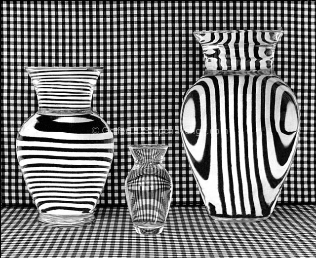
This is a variation of the picture I submitted in the Water Challenge called "A Vase Filled With Water". I really enjoyed setting up and taking this picture and wanted to try to take the theme to the next level. Unfortunately my camera was in for repairs until only a few days before the deadline. I see some things in my submission which I wish I had had time to correct.
The technique I used is similar to the one I used in the Water Challenge except I used a checkered material as the full backround behind the vases and striped backrounds taped vertically and horizontally to the large and middle sized vases. The small vase has no backing. The vases were filled with water to created the refractive effect. The picture was cropped, sharpened, desaturated. The contrast was increased and the cloning tool was used to eliminate some of the aberrant reflections and mild defects.
Statistics
Place: 33 out of 69 Avg (all users): 6.7513 Avg (commenters): 7.0746 Avg (participants): 6.0357 Avg (non-participants): 6.8684 Views since voting: 3694 Views during voting: 1008 Votes: 398 Comments: 77 Favorites: 19 (view)
I just hit your profile's site because I wanted to thank you for the encouraging words on my minimalism entry, and I have to agree with messerschmitt's comment "its been a while since a photo knocked me out of my shoes, this one just did" - I have to echo that sentiment! WOW, what a great shot!
Well anyway, thanks again for the kind words and I look forward to more of your work!
I want to like this more, but the uneveness of the line from the bottom to the back and the wrinkles in the material put me off. I like it very much and feel that it could be better without the aforementioned distractions.
great concept. the composition is good, not incredible, and the image quality feels a little interpolated. keep experimenting like this though, it's always good to see something fresh!
this is an interesting photo - though not original.
i like the differences in the refraction of the different vases.
but find the chekerboard BG a bit distracting.
This is such a cool idea and setup. I'm really curious to find out how you set up this shot. I do feel like the image would be even better and have more impact without the smaller vase, but it still looks great as it is. This is a really outstanding photo.
Huh? How did you manage to get the 3 different types of reflections? That's amazing. II'd be willing to bet that not everyone caught that though. Great work.
Certainly a shot to stand out amongst the rest!! Kind of hurts the eyes a bit... Only gripe is the cloth on the bottom RHS is a little rumpled, it's the little things that count. 8
Strong points: It's an exceptionally graphic image. There is a lot of visual mystery because of the orientation of the lines in the vases - it doesn't male "visual sense." There are strong blacks and whites - but a very narrow pallette of grays.
Suggestions for improvement: Certainly an artist who could create and shoot this image could find a better title.
Looks like it should be in a museum of photography. Well controlled reflections off the glass and I really like the contrats of direction of line that these simlar vases give off. Well done. 8
Love this shot, very high impact. I wish the lines were straighter and more level though. I think this will end up being one of my favourites this challenge. 9
Nice monochromatic patterns. The two large vases show the pattern very well and it appears to be quite sharp, however the pattern in the small vase seems a bit dim and the focus seems soft. This could be related to the quality of the glass or the distance from the vertical pattern. The exposure seems right though. 6
My eyes hurt! LOL! Very well seen. Cool abstract. My only problem is that it does not seem very crisp. The focus looks soft, especially on the middle vase.
I like the idea here. The use of the vases to refract the background pattern is fun and black and white is a good choice. However, I think there is too much clutter going on in the image, especially with the small vase where the pattern is all mushed together. I think this might have worked better had the camera angle been lower and strit on so that you wouldn't see the pattern on the tabletop, just the wall background.
I like the idea behind this photo but somehow the execution seems to lack punch and wow factor. Contrast is excellent as one can see the subtle grays in the background pattern. 5
nice photo and gr8 effects though while looking at the photo it becomes rather hypnotic... i feel that possibly the pattern has been overdone on these photos and maybe look at next time to remove the floor pattern though im not sure as to what implications that would have on the pattern shown on the vases....
in general though its very vivid and possibly too much as the patterns really are hypnotic... gr8 effect and gr8 idea !!! though possibly just a tad overdone IMHO nice work though!
I've seen shots like this before but this one is confusing, cos there are no vertical lines on the left vase and no horizontal ones on the right... I have no idea how you did it :) It's a good shot but I think it lacks anything particularly special. The angle is just flat on and the composition is just centered, just like every other shot of this type. I would really like to see someone try this experimenting with the angle and visual appeal/impact of the photo. 5
returning for comments.
A very compelling composition with many eye pulling motives. Since the background pattern and the table cover is predictable I wonder what it would yield if the items were brought closer. It is nice because the eyes just jump from item to item without resting on the background. The fact that each vase is reflecting its own pattern adds the needed interest. However, we are not going to judge this image as a standard still life. This image has a ticket into the abstract realm. the B/W makes it so special and better to look at.
Interesting effect...I guess you must have pasted card behind the two big vases(?) but I feel it lacks that eye-beating snap that some water/glass/background shots have. The focus looks a tad off and the composition looks very military and symmetrical
I wonder how many people will notice the structure of lines in the vases is not all the same and does not match the background. Did you put separate cardboard with lines behind them ? Very nice. I find the very slight irregularities in the background material distracting, nothing major, but not perfect. Cropping in the middle of the last dark line on the left would have reduced attention to that.
What an interesting study of lines and curves. Amazing shapes that water creates. Slight wrinkles on bottom right a little distratcing. I like the horizontal, arch, and vertical stripes in the vases. Great study.
woah.. man.. I think you've single-handedly caused me to need glasses. Incredible idea, the lines and B&W just shout out at you as loud as they can. Only problem I have is that I'm not getting the strongest compositional feel from it, but damned if I can explain why.






 Add photograph to your favorites
 Add photographer to your favorites

 Photographer found comment helpful.


