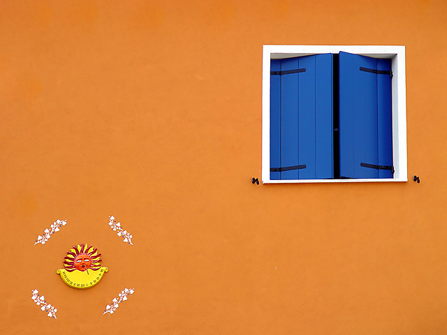
Shot this in Caorle in Italy.
As the image was a little from an angle I skewed the picthre a little to make the window vartical.
Cloned out some uneveness in the wall.
Levels. Saturation.
Thats all.
Statistics
Place: 24 out of 69 Avg (all users): 7.0603 Avg (commenters): 7.8933 Avg (participants): 6.8214 Avg (non-participants): 7.0994 Views since voting: 3038 Views during voting: 931 Votes: 398 Comments: 82 Favorites: 10 (view)
This photo, for some reason, really turned me on. I didn't know how well it would place, but I handed out an extra 10 on this one hoping to see it score well. Congratulations! And thanks for showing us that even the simple things in life can be beautiful.
Super shot, and I agree with those who suggested cloning out the sun thing on the lower left. Just the wall and window is enough for a fantastic picture.
i love this image. it is my top pick for the challenge. i love the colors, the composition, and most of all, it's sheer simplicity. it really goes to show that if you stop to look at what's around you, you can find some really incredible images. great job. good luck with the challenge!
This is a well done photo. The only thing is that I find my eye wondering to the sun on the wall instead of the window which is what I think you want the viewer to focus on. Maybe try cloning out the sun and decore around it and see how it looks. Just a suggestion. I feel this would be a great negative space picture. Good job. 5
It's perfect. I'm not sure if the motive on the left is painted, or hangt, or added during processing? Maybe leaving it out or leaving more context would've help? The window alone on the yellow wall is wonderful.
Great eye for color and composition. I like the positioning of the window. Unfortunately, I find that the plaque and the surrounding decorative painting detracts from the simplicity. It might be possible to crop out the bottom section and retain some of the vitality of the composition. The tension will be a bit different but it still could work.
You know -- I think I would have liked this photo better without the things in the left side. The colors of the wall and the shutters are beautiful. The sun is a distraction. Simplicity would have made a bigger statement here.
So simple. Yet I like this shot more than most of the other shots in this contest. It is clear and in focus. Which all of the shots should be in the Master's Challenge. I love the colors. Very bright and very contrasting. Good job.
This has great colors, and the focus is really great. I'm giving it a 7 though, only because it doesn't grab me enough for an 8, 9 or 10. It's a nice picture though.
Strong Points: Superb composition using colors that really sing together. Exposure is dead on - and the flat lighting really helps. Suggestions for improvement: I really don't see anything you could have done any better!
10! I'm a sucker for cool, saturated color blocks, and you've done it. Another work of art in this master's challenge. Me personally, I would have liked it better without the ornamental thing in the bottom left corner, but it's nothing I'm going to deduct for.
Wonderful colors, but very little texture... I guess that means the painter did a good job on the walls ahaha... anyway, I really like it! It's this style of architecture I miss in my urban environment...we don't get much of these hues in NYC, sadly. Thanks for this, I enjoyed the eyecandy!
This is like a moden art interpretation but the sun figure does not win my entire interest. I love the colors and the window frame and of course the color of the ajar window doors. This is a great vibrant feast for the eyes and as such it gets bumped higher.
simple and effective with great bold colors. I wish there was a little more of the background wall at the bottom of the frame - the sun and the garlands look a little crowded in the lower corner.
Separately, I think the two elements of this photo would be very good but I don't think they work well as a combination. They each are fighting for attention and, worse yet, they are in opposite corners. The colors are nicely saturated and focus appears to be nice and sharp. 5
lovely composition and lovely contrast.... this photo as it is i would not want to change a darned thing... i love the colours and patterns :) the only thing possible and thats after looking at this image for a very long time... is possibly considering opening the window a tad more to introduce more of the black tone... i reckon it would provide an added boost to the contrasts already at play though i really have no idea until i see the final product.... gr8 photo and i hope it rates highly :)
Nice strong colours, good perspective. Very simple. However, for this to sing I'd love to see some texture on the wall, something to make it more than just colour. Love the composition!
I really like this image I think I would have liked it even more without the decoration on the bottom left corner
I love the blue agaisnt the orange
very crisp and nice work
I love the window. The color and focus are outstanding. I believe that the shot may have stood on it's own without the decoration in the lower left. It almost takes away from the beautiful window. Really nice shot.
This is a nice shot, but the colors are so vibrant, it would look better without the sun and it's surroundings. Good use of off center composition, however I feel like I'm drawn between two subjects. 6.
Wonderfully vibrant in colour and in shapes. Feels a little lacking in texture though. Nice composition, nice use of space. 7 (//www.dpchallenge.com/forum.php?action=read&FORUM_THREAD_ID=129433)
I really love this one- I love the colors, the complimentary colors are so strong and give such a mood. It's be even more perfect if t hat little sun thingy wasn't there but it's still really great- so calming and interesting. Great job! 9
Great color contrast... the consistency of the orange across the image is perfect... I'm very impressed if this was done with available light. Perhaps a looser crop, or a hair less on the bottom, would balance it even better... but as is, great shot.
I like this image a lot. It reminds me of Greece. Is it? I think I'd like it even better though, if it was just the window on the wall. Blocking out the lower left hand corner would do wonders for the composition.
Very nice rich and vibrant complementary colors, not too saturated and very clean looking. I also like the uncluttered appearance of this photo and glad you did not include a border. I do however, wish you cloned out the two hooks below the window, as they are slightly distracting. The sundial gives an interesting foil juxtaposed with the window. 8
sweet. really like this. might like it even more without the sundial, frankly. fab contrast in colours, and simple lines. it takes a good eye to see this kind of shot. I'll bet the surroundings would paint an entirely different picture.
I love the vibrant colors and the soft light in the image. I think I would have preferred just one main focal point, I find my eyes moving back and forth between the sundial and the window. The window is non square, probably due to your viewpoint below it, I would have tried to distort it to make it absolutely square, although it also works well as it is.
The colours here are really nice and vibrant. I would like to see the right side of the photo on its own, with a crop down the middle, because I think the sun at the bottom right spoils the simplicity and composition, and I'm not sure why it's there. 6
This would be a ten for me but there is a synthetic feel; there is also a weird spacing to the decorations around the sun. I absolutely love the orange color, the white sill and the blue of the window. I think that the window and negative space would be enough... nice entry anyway.
Classic window-wall shot, and superbly executed. You may have oversharpened just a tad, but the color and clarity here are fantastic--requirements for success in this kind of image, in my opinion. Very nice! 8






 Add photograph to your favorites
 Add photographer to your favorites

 Photographer found comment helpful.


