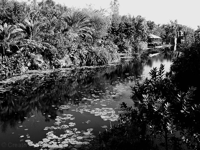
Very high contrast image. Trying to reconcile the title with what I'm seeing, and I'm not really sure why you chose to present it in B and W. It's almost as if you're being ironic, when you say it's 'at it's best'.
You've got a blown out sky, and sharpness seems a little low...The picture is really busy with all the tiny details, but there's not really a clear or specific subject. With all the contrast, it's got an old movie feel to it.
I'm interested to hear more about what you were trying to do. :)
It was an interesting decision to make this a black and white. Was there some specific colors that you didn't like? I think I would have preferred it in color. The large dark area of bushes on the right side is distracting. It feels too dominating of the scene. I do really like the lilipads in the water as well as the fine detail in the trees and around the building. The bright areas appear a little too bright and I wish the sky could be darker. I like the composition in the way that the river leads the eye to the building. Technically it looks very good, clean and sharp. 6 -T
This reminds me of the old Tarzan movies I used to watch when I was a kid. I think this a great photo. I'm curious to see what this looks like in color. Good work and good luck.
I wonder why you chose black and white here. It looks like it would be so lush and green. I love black and white but I think it makes this shot a bit too busy.
I find the black and white a little too harsh - especially when the title mentions "nature" - I expected some natural greens and blues. It looks a little like an old photo and has lovely composition but I think colour would have gotten a higher vote from me - I don't see a need for b&w for this photo.
My first impression of this picture was that it was a finalist, for sure, but...the more I look at it, the more it hurts my eyes to try to look at all the details. Given the B&W, it makes it hard to see where one thing stops and another starts. It is a very busy picture, so perhaps the colour version might have helped to define the different foliage in the background. Then again, maybe it would just add to the confusion. The river, foreground and destination are great. The foliage makes my eyes bug out. I still give you a 7. I would love to see the original colour pic. Also, I would love to go there. where is this?
Why black & white!? I would have really enjoyed seeing the greens in the palm trees and the colors of the water in this shot. I don't feel that B&W does anything to enhance the feel of this one.
I don't like this in black and white. I think there is too much color to be lost. The only justifiable reason IMO to put this in black and white is a problem with one of the colors (like the sky being washed out). There is more to lose than gain by making this B&W. - Inspzil
This shot is almost too busy(the trees) for black and white. It was a bit hard on the eye to look and figure out what it is I am looking at. The reflection in the river helped.5.





 Add photograph to your favorites
 Add photographer to your favorites

 Photographer found comment helpful.


