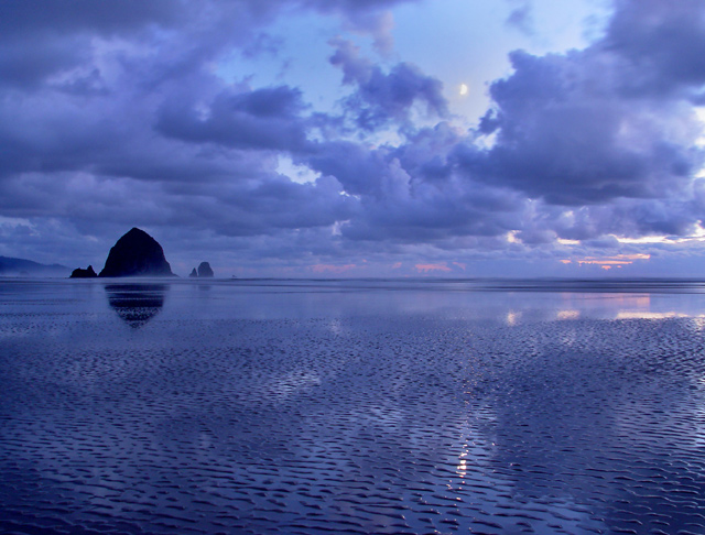
Took this after a brilliant sunset had passed. I was actually down at Haystack durning the sunset, but now I wish I was right here during it. On the way back home I glanced back and saw this scene. It was to beutiful to pass by, even though the sunset was over, but I'm glad I did. I ended up liking this shot better than any of the sunset shots at the rock, and better than any others this month.
Editing: minor rotation, levels, dodging/burning, resize, slight usm.
Statistics
Place: 9 out of 69 Avg (all users): 7.5915 Avg (commenters): 8.0889 Avg (participants): 7.2069 Avg (non-participants): 7.6569 Views since voting: 8928 Views during voting: 970 Votes: 399 Comments: 108 Favorites: 61 (view)
Thank you everybody for your votes and comments. I am very happy with the placing and score (my top, by far), but also getting the 2nd best image for my camera!
Thomas: you have hit the ball out of the park with this image and if the challenge had been "Moods" this would be a blue. Your work and quality is just great.
Congratulation on the top-ten finish Thomas. I'm really surprised that this didn't get a ribbon. It is such a fantastic photo!
As I’m sure you know, the coastline of Oregon has an abundance of dramatically beautiful scenery—some of the most picturesque locations on the planet actually. You should get out and take a shot at capturing more of it. I feel quite sure that you have the talent to do it justice.
Great photo! The unity of composition, color, mood and title make this a sure 10! If only I could vote. Thanks for a great capture of that beautiful rock in one of its many moods. I also love the surprise of the moon's solitude, looking down upon the rock's solitude, both observing the photographer's solitude. Very peaceful and a likely ribbon.
One of the many 10s for this challenge. Perfect balance of color, texture and composition. I love the hint of mist near the rocks. Thank you for sharing. 10
The ripples in the water add a nice texture to this shot. There are three elements that draw my attention: the sky, the rock, and the water. As the water is the most unique element in the shot, I'd like to see a crop wherein the water occupies the bottom 2/3 of the shot, or a horizon more biased to either the top or bottom of the frame. If the rock was dead center, it would play well with the vertical symmetry. That said, this is a lovely subject. The moon and its reflection are nice touches as well.
I love this mix of purple and blue... even the moon is reflected on the beach! It really is a shot I have not seen before (in terms of colors and waterscapes), and I gave it a 9. Good luck!
while this is an absolutely beautiful image, i think it would be much stronger without the moon and the moon's reflection. they are a distraction that forces my eye away from Haystack Rock, rather than letting my eye wander, leisurely absorbing the rich colors and textures you have captured. it's amazing how something that small can have such a strong impact on someone's viewing experience.
Frameworthy hues and good DOF. One of the best landscapes in the group. I might have cropped with the horizon a little higher or lower for a more asymmetrical composition.
I love it. I don't know what could be imroved. Probably the quality suffered during resizing, but I love the coulors, the composition, everything. I only wish the moon (?) wasn't so blurry - but it's probably due to resizing process, as I said earlier.
Superb scenic and perfect timing when the moon broke through the clouds. The moon's reflection in the forground is the prefect counter point. All the techie stuff (exposure, composition, DoF) is excellent. You are the proudreceiver of my 3,000th comment - which will win you absolutely nothing!
I love the sharpness in this image. Also, the centered horizon is interesting. I wonder if you'll get lots of negative comments saying "learn the rule of thirds" but I think it works fantastically here.
I just noticed the moon. Was this taking at night or at dusk?
Stunning. Love the colors and the beautiful ripples you,ve captured so well in the forground. My first impression was that it might hace been better if it cropped tighter along the bottom, but those priceless ripples would have been lost. Well done!
This is a lovely landscape. The texture on the sufrace of the shoreline is a nice point of interest as well as the rock in the discance. I think that particular element is stronger than the sky in this shot. It may have been beneficial to shoot this from a very low angle, close to the ground. You could accent that texture by doing so and include less of the sky. The centered horizon seems to work ok in this image, but it may be stronger at a higher level with more foreground included...
What a beautiful shot, so serene, so calm, so blue! This is well done and the rocks on the left offer just a bit of break in the horizon to keep it interesting. My only complaint, and believe me, I feel silly giving it, is it lacks a final POP factor, something to really make it jump off the screen at me. The over all colors are lacking just a touch, a 9
Oh joy! I love this! (Pacific Northwest US, right?) I love the blues here, the small shades of pink...really beautiful coloring...excellent composition! Striking photograph, thank you!
Beautiful! Love it! I wish the sky and sand didnt meet exactly in half, rule of thirds would work really good here, like you have with the mountain. Maybe a lttle more dodging and burnng would be good also, just a suggestion.8
A beautiful scene. The blue tones give your picture an added sense of serenity. The glare in the water towards the foreground is slightly distracting but otherwise a near perfect picture. Great job.
There is an unquenchable thirst by many people to embrace blue monochromatic images. This capture will satisfy the urge in many and in myself. The touches of dusk orange, being the opposite color of blue enhance the welding of the horizon.
Wonderful, Wonderful shot. If anything I would like the rock a little more into the picture and a little lower. It looks like the sun is high in the sky, but yet the horizon shows the color of either a sunset or sunrise, seems odd to me. Or is that the moon up there? 9
This is just beautiful, one of my favourites this challenge. The central horizon works well here. The rocks are what makes this shot work so well. The textures in the sand are breathtaking. I love the reflection of the moon in the water, but the moon itself doesn't quite work for me. Gorgeous colours. 10
The texture contrast between shy and shore is great. The rock adds interest. I think the picture might become even more interesting if it were cropped just above the moon to give the interesting bottom half a larger area.
Part of me thinks the horizon should be moved up or down, and the other part of me says the symmetry makes this great the way it is :-) Visual tension is good, though. Great shot.
I'm a sucker for these type of shots. The blue hue works well here, and I love the texture of the sand. The hints of mist around the rocks really catch my eye.. but there's something very subtle missing. I can't really put my finger on it though.
When working with water reflections, I tend to brighten up the reflection a bit.. perhaps that's what I'm looking for here? Sorry. Wish I could give a more concrete suggestion. Still, this is a solid 9.
Brilliant DOF here, good clarity throughout the whole shot. I think it's mist in front of the rocks on the left, takes a wee bit away from the shot as I think it makes it look a little hazy. 8
Awesome view. I find it a little too blue, for my taste. I'm not crazy about the very centerered horizon, either. Perhaps croping just above the moon, leaving more of the textured beach below could work. Just a thought.
I have knocked other images for having the horizon so slose to the center of the image but it works very well here creating an artificial symmetry that has interesting compositional elements that balance one another in both halves of the frame. the clouds offset the water ripples and the rock provides the focal point. well exposed and great colors!
Canon beach.........do we ever get tired of seeing pictures of this place?
Not as long as they are this good! The blue tone of this picture, the vastness of the beach, the still water, and undisturbed sand all lend to the creation of "solitude"
Excellent image.
These rocks are a very popular subject and I can see why.
The reflections and ripples in the sand add interest in the foreground of the image making it a very satisfying picture overall.
Beautiful classic seascape shot. Blue color and visible moon really gives it mood. Though the horizon line is midline and gives a static feel, that's fine with this tranquil moment. Good job. 7
If this were not absolutely breathtaking, I might have lowered the score a point just because I am tired of seeing that rock but . . . . it IS absolutely breathtaking. 10.
I wish I could give you 11 for this shot. This is one of the best photos on DPC. Love the patterns in the sands and the subtle reflections. This kind of photo I would definitely hang on my wall.
If I were there, I'd probably be so awe struck that I wouldn't know how to work the camera into auto, let alone take a great shot like this. The blue is very appealing to me and the title gives it a wonderful context. Top 5 picture in the challenge IMO. 9.
I really like the blue tones here, and the texture of the low tide beach gives a great contrast in the lower area to the cloud layer above. The silhouette of the rock helps anchor the horizon. A great landscape, which are generally pretty tough to pull off. (I know I can't do them very well). Great shot. 8
Small critiques, because I do think it's very good but just so I can offer something constructive. I find my eye dancing about a bit between the haystack rock, the moon, the moon reflection, and the dark shadow in the lower left corner. Just a little distracting to not focus at one area/subject.
This landscape looks familiar. The blue colors certainly help give it the look of solitude. The difference in the textures on the water give it a mysterious feel. Great shot.
This say ahhhhhhhhhhhhhhhhhhhhhhhhhhhhhhhh to me. :-) I think that the 50-50 split works well here and the color range is quite soothing. Th elight and dark side, even though subtle, balance out quite nicely. Good job! 9
The pattern in the foreground, whatever it is, is really neat! The rock formations have a great symmetry, both laterally (with the two smaller formations balanced on either side) and vertically (against the reflections in the water). Moving the horizon up or down a bit (perhaps to a thirds line?) would give us even more of that foreground pattern, or more of those puffy clouds.
Here's a great example of when the rule of thirds was meant to be broken. Beautifuuly clear and wonderful colors. I love the slight glint of the moon in the water(beach). The time of day of day couldn't have been better.
I have seen this rock before (zoomdak ?), but never in such an atmosphere. I love the blue. I love the wide space around it this time, the low tide and the sand pattern. The image gives plenty of space to look around in, while also providing a resting point in form of the rock. The moon in between the clouds is a nice touch as well, good timing.
This picture is breathtaking. the patterns in the bottom half and the clouds give it so much depth. the reflections are beautifull, the sky has wonderfull colours. simply a great image.
and i love the moon =)
This is my pick for the winner - however for me it isn't all that special (I can hear the gasps now). I do like the blue that has been captured / enhanced and the cloud formation is very nice too.
but I can't help but feel if a 'better' photographer had been here they would have captured something so much more interesting.
There is no foreground interest what-so-ever and likewise no middle and apart from a small rock or two no background either.
It solely relies on blue and clouds which whilst looks nice for a few seconds - it doesn't go beyond that.
Composition is a little let down - there are some interesting patterns being made and reflections too on the flooring - and I feel perhaps giving 2/3 of the scene to this would have been better. Generally it is said not to place the horizon in the middle, and this is when that rule works.
Another area which looks interesting is the rocks - they are large and looming with some nice ocean spray coming off of them - but you have made them so small they look like small rocks and hardly figure in the photo.
I am being overly harsh here, because I feel this is good - but some scenes are so that one can't help but shoot anywhere and get a fairly decent photo. And considering where you were and at what time - a bit of a waste.
Excellent use of patterned negative space. Love the details of the fluffy clouds and the mini sand bars in the water. I'm also impressed that you were able to capture the subtle hints of fog along the rock. Now for the negative. I feel there is almost too much negative space at the bottom of the frame but I understand you wanted to show the details of the water and sand. 9
II love the colours here, and the reflection is great. Is that the moon between the clouds? Fantastic shot. I think if you cropped in a bit closer on the rock (but not too much) it would be even better. 9
Hi Zoom...this is my favourite photograph of Canon Beach thus far. The textures in the sand are phenomenal and the balance is extraordinary. The reflection of Haystack Rock is what makes this for me. The moon is also a great addition to this piece. If the moon could be sharpened up a litle bit and maybe burnt in just a singe...it would be all too perfect for me. Although the skies look burnt in a little as it is, try experimenting with some more burning, maybe closer to Haystack Rock with the smaller clouds farther away. Good luck on a great image. The first 10 in the challenge from me.
Lee
Would this be the work of young Master Robinson? :)
It's a beautiful photo. To my eye, it looks like an early evening low tide at Cannon Beach. I think the colors are beautiful, but I wouldn't be surprised to see comments like, "Too much blue."
Congratulations on a great photo. One of my top picks so far.







 Add photograph to your favorites
 Add photographer to your favorites

 Photographer found comment helpful.


