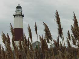
The composition of this shot is great - I love the way you've used the foreground grasses with the lighthouse in the background. Also, the way you've got the effect of the wind on the heads of the grasses contrasts nicely with the very solid feel of the tower.
One thing I would suggest with this shot would be to crop/zoom out a little bit more, if possible, or to take the shot further away - this way, the line of the darker area across the bottom of the shot and the tower itself would be nicely on the Rule of Thirds lines.
Another suggestion would be to flip the shot left<->right, so that the tower is on the righthand side, so that the eye leads in from the lefthand corner (the natural start point) across the row of grasses to the tower on the other side.
Background:
The background is an integral part of the composition of the shot, and thus is covered in the above section. In addition, the sky is quite interesting, since it's not a generic clear-blue, but would really benefit from some levels & contrast adjustments, so that the tones within it stand out more.
Camera Work:
The focus and depth of field (DoF) on this shot seem OK, with both the grasses and the tower in focus, but since the shot is small and you've not provided any camera settings info (Aperture / ISO / Shutter), I can't really say much more.
Post Processing:
Since you've not provided any details, I can only guess as to the post processing you've done, if any. Firstly, this image is tiny! It definitely doesn't hit the 640 pixels maximum in either dimension, so the image here is much smaller than it could have been - this means that there is less detail for people to see, and thus makes it harder to get interested in the shot.
Secondly (and due to the small resolution), this shot is only 8Kb (!), out of a maximum 150Kb, therefore you may have lost quite a bit of detail by compressing the image down to that size - I always recommend that you try to get as close to the 150Kb line as possible, so that as little detail as possible is lost.
Apart from all that, it looks like a very gloomy day, which you can either emphasise (b&w might work will in this case), or reduce by playing with the saturation & levels to make it seem brighter.
My Opinion:
This is a potentially very good shot, but needed more post processing work and a little more thought on the framing, so I'd rate it as slightly below average. As for meeting the "Landscape" challenge, it definitely does that, and the buildings in frame integrate into it nicely, rather than distracting.
If you have any questions about this critique, please feel free to contact me via the PM system.
Unfortunately there isn't a lot of colour in this photo. It also seems quite small - was there a reason for not making it larger? I might have considered holding the camera a little higher and showing the grass heading towards the lighthouse, to show it towering about the flat ground.
Great point of view, composition, depth of field...If you would have pushed your ASA/ISO to it's max, then you could have shot at a faster speed which would have stopped the moving of the grass, and you still would have been able to use your F22/F26 aperture setting to have the depth of field you wanted. Excellent eye, good luck, JG
Neat shot, really like the foreground grasses! This is a pretty small view, hard to tell on quality issues like focus. I need more, please. Score 6 for now. Swash
Small picture gives poor resolution. Great composition, but hides what the surrounding "landscape" has to offer. Would have been great to catch the "light" of the lighthouse, wouldn't it?
This photo has nice composition and a nice feeling about it. The quality is difficult to gauge at this size but it looks pretty clean to me. The color seems a little flat and could really use some saturation. You should keep this scene in mind for when the sky is real dramatic. 5
The small size hurts this photo. I like the seagrass in the foreground, but I tend to think of a landscape as more of a wide angle type shot. It is also a bit dim, but has potential.
It's a nice idea but just a little too small for my liking. It would be interesting to see it converted to monochrome, to see if that brought out some contrast in the sky.
This could stand to be a lot bigger. I think the perspective is a tad low as the grass is swallowing the building. It also seems too dark or underexposed. I would like to see more lighting for sure. Otherwise, it has a LOT of potential. Great photographic spot.





 Add photograph to your favorites
 Add photographer to your favorites


