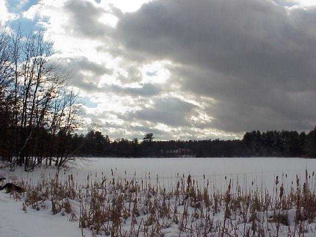
I'd like to thank everybody for their comments... just one explanation - I didn't edit this picture at all, that's the answer to questions like "what did you do with it" and comments about the "grain"... as far as the comments about darkness and gloom - that's exactly the feeling I was going for... of course, I would love it if all the comments were like the one from Becky, but I try to learn something from every one of them... thanks again!
PS: the suggestion about neatimage proved to be very important, i've been using it even since!
Right now I'm stuck betwee a 9 and a 10. The sky almost pushes it to a 10. I love how it goes from beautiful blue and bright to black and menacing. The framing with the weed in front and tree in back is great. Great one.
I'm sure everyone has already said that the grain detracts here. Additionally, the pins-and-needles feel of the brsh and the trees on the left really give the picture an unpleasant feel.
It seems pixelated in the weeds in front (over sharpened, maybe?) and there is noise in the sky. NeatImage (you can get a free download) is dpc legal and awesome at removing noise.





 Add photograph to your favorites
 Add photographer to your favorites


 Photographer found comment helpful.


