boldly shown. sometimes simple is good. In the case of this controversial work by an author who later regretted it, maybe this pointer to the thin thesis that sustains it is the best we can hope for. I am not convinced the limited DOF serves in any way the composition or the idea. 5
Amusing take, Georgie, though a bit Dim overall and it kind of Peters out on the right side, don't you think? ;)
Fantastic choice for a novel, I had thought of this book initially myself though opted for different later.
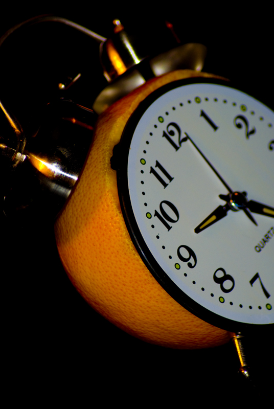
I personally think the shallow focus provides several levels of appropriateness and it certainly looks thick skinned, hopefully it doesn't have to randomly attack people for no particular reason.
a 7 from me
3...cute idea, it's just not what I was looking for with this challenge. The lighting could use some work...it seems a bit harsh and flat all at the same time. Natural light might have been a better choice.
This image does bring a smile to my face. The shadow at the top looks more like a rotten section of orange so is a little distracting but I do like the awkward composition. 7.
Cool. Good concept, nice exposure colors. I would have tried to keep it all the numbers in focus. Even though it's neatly put together I would have spent a bit more on the finish of the set up - the orange dial on the 11 - 12 hours.
I will give it a 6 but might come back later. Good Luck
Interesting interpretation of the title.
Don't like how you've chopped off the clock. The orange seems a little "flat"
Perhaps some different processing/lighting to give it more dimension?
Gave it a 4
Very kitschy, looks as though you've gone to a bit of trouble in the props dept, nothing wrong with that though. Not much in the way of relating to the novel other than literal interpretation of the title, maybe a bit more lighting on the orange itself (or processing) would pep it up a bit. 5.
very creative! At first pass, I never noticed the clock was actually an orange! Very crafty and subtle. Exceptionally sharp detail on the clock face, and nice soft lighting!
Nothing bores me quite so much as a photo of a clock on a black background. The good part is that you stuck it on an orange. The bad part is yet another person making this "joke" about this title. 3
A literal illustration of the title.
I wish that you would have included some violence, at least between the beauty of an orange and the technical rigid mechanism of a clock
5







 Add photograph to your favorites
 Add photographer to your favorites


 Photographer found comment helpful.


