The most important thing I want to say is that I have enjoyed and appreciated all of the comments and I thank all of you who participated in the comment challenge for doing so. I want to fill you in a bit on the circumstances surrounding this portrait, especially as they relate to recurring themes in the comments.
First, this entry is a shoehorn. My life right now is crazy and I'm really scrambling to come up with as many viable options as possible during the TPL. In this case, it was shoehorn or no entry; I went with shoehorn and am quite satisfied with the final score which I am hoping will put me at or just above the 50% mark and the balance of the comments.
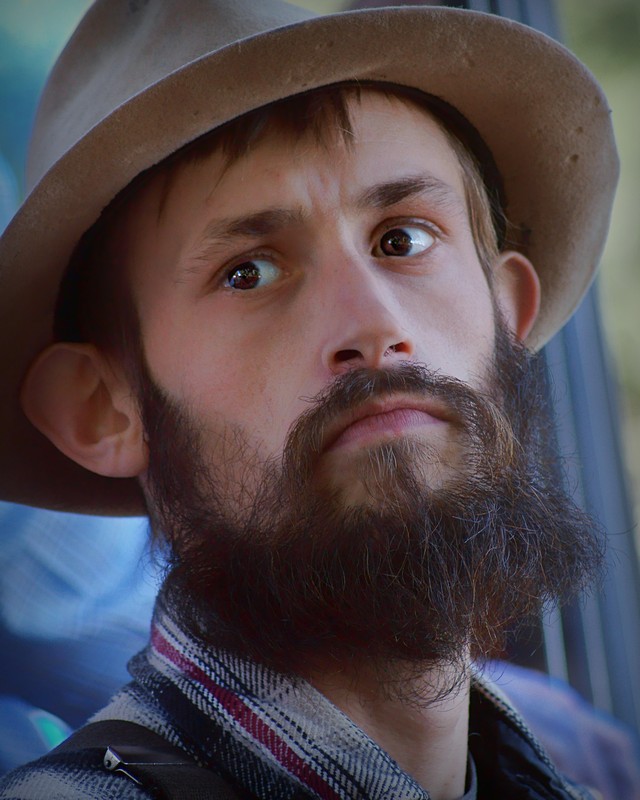
Second, it's a candid shot. This man was playing on a stage in a bluegrass group at an outdoor festival. I had to use my 70-300 to get anywhere close enough for a portrait; this shot was at 200 mm. The trickiest part was isolating the players' faces from one another and from their instruments. You see bits of both in the admittedly regrettable background. I got some with the full hat but this one had by far the best expression IMO and the top is not cropped. Therefore I chose to crop quite close on the left in an attempt to balance the shot and make the cut-off top less noticeable. I also colored several parts of the background blue - why I left the green on the right, I don't know. And why I didn't try black and white, I don't know either - it works much better.
Is this guy Mennonite or Amish? Almost surely not Amish but I can't really say. I just thought he looked "period" and had something of the angst or at least distraction one might associate with an artist, so I went with the title.
That's all I can think of for now - but again a most heartfelt thank you to all who commented. I sincerely appreciate your giving of yourselves and your time.
Statistics
Place: 41 out of 86 Avg (all users): 5.8155 Avg (commenters): 5.8095 Avg (participants): 5.7436 Avg (non-participants): 5.8594 Views since voting: 630 Views during voting: 228 Votes: 103 Comments: 24 Favorites: 0
I had to come back to this one. There is something not working well here. The background (the right side) but at the same time his head angle and the look are together closing a nice circle. He seems concentrated yet void. bump to 7
Comment Challenge: This is a great picture. I love the worried look between his eyebrows, the contrast of the background and the man, and that he is not looking directly at the camera. To me, this speaks of an artists' uncertainty of whether his art will be accepted and appreciated.
4...seems more mennonite than James Joyce. Or maybe he's just a hipster. The crop is strange to me, too tight perhaps? I keep wanting to see the whole hat.
Not having read this book I did a quick Google search and found a few images representing this novel. You have captured the general composition here too so there should be little risk of DNMC voting. I'm not sure how much control you had over the background but I wish the nice blues extended beyond the right hand side of the image. The details captured are very good and I quite like his expression. 6.
Good enough as a serious young portrait, but there's nothing to hint at his artistic side. Photographically, although the skin tones work well enough, the background colors are muddy the forms have no clear compositional purpose and therefore become distracting. I think black & white treatment could have been much stronger and eliminated the color issues. 5
Frankly I'm surprised this wasn't done more. I for the most part want more ties to the story, but this is a little different. It still loosely reflects the story, but is a play on the art commonly associated with this book. For that I can forgive the beard, but the round glasses are a crucial part of that art. 6
What's nice about this, is that it actually feels like it's a reasonable period piece, faithful to the time in which Joyce wrote the book. The eyes are terrific, the ears weighted down by the hat, the upthrust chin: there's a bit of bewildered, a bit of apprehension, a bit of resistance all speaking here.
The eyes aren't quite as sharp as the nose and lips, and I'd like them to be tack sharp. The skin color seems a little cool to me. But allin all, a very nice entry. 7 from me.
I an one of a few that have taken on the” Comment on every vote challenge”. I will post the score I gave you then try to explain my reasons for said vote. Hopefully nothing below will be taken personally, and maybe we can both learn from it..
Although a fine portrait, there is little that ties this to the 19th century, although the hat helps a bit. I am hung between quality of image and believability of challenge topic. I will place this in the middle and give a point for the hat…6
Wonderful portrait. I am not familiar with the novel, but it doesn't matter. I like the soft natural light, but a little more contrast may have added some points.
I like the shot. I particularly like the expression on his face...almost a look of destitution. I am not getting Irish as much as I am getting Amish. I know Amish isn't a nationality, and I guess you could have Amish Irishmen.
You found a good enough hat and a young, slender man, and the title goes well with the portrait only that it does not go too well with Joyce. It is a good shot but I am not capable to really like it.
5
This shot feels like it needs something.
More sharpness in the eyes, more clarity/detail in the beard... the skin to be "glowing" a little.
It's got potential...
Gave it a 4
He looks a bit disturbed, as artists should ;) A nice tight crop, probably could have come in a tad more on the right side. Fits the theme, he looks like a musician. Doesn't go any further than the look though.5.
In general, I'm not a big fan of portraits that are cropped this close. It's too hard to get a sense of a person this way. Sometimes it's pulled off, but not in this case. The background elements are distracting. 4






 Add photograph to your favorites
 Add photographer to your favorites


 Photographer found comment helpful.


