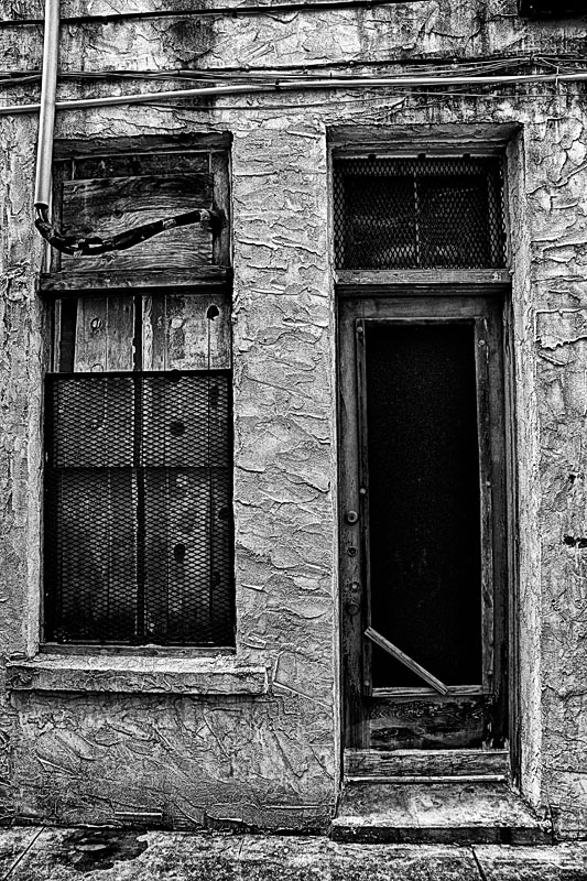
Comment Challnege: Love the texture and tones in this. The wires in the upper part are a bit distracting. Interesting contrast between the metal armored windows and the empty / open doorway.
Initial Reaction: An interesting old building entrance, unsure of book.
Suitability for Challenge Topic: Wiki tells me this is a book about poverty, and while this does appear more commercial than residential, I think it fits, at least to a point. Nothing here really compels me.
Aesthetic: A bit too high contrast for me, while still not really making anything go 'pop'.. Perspective is really quite off, and needs correcting.
Needs Work: Perspective, concept
Final Thoughts: Not bad, but it doesn't really have the impact I would want for this book.
Score: 5
I hate to nitpick topicality but the book is neither a novel nor can it be considered a "classic". However the image seems suitable, say, as a possible dilapidated building where the author might have lived. As to the image itself, I enjoy the collection of textures and spaces, even the random wiring that characterizes such a run-down urban residence. But visually the problem is that there is so much going on that the viewer is quickly overwhelmed with too much information, especially with the texture-amplifying processing. Personally, I'm drawn to the deep blackness of the door, but distracted by the surrounding activity. I think a tighter crop on the window and door would make the impact much stronger. It's a tough subject and the image reminds me of many I've taken myself but disgarded because I couldn't decide what to do with them. So your effort is commendable but I can't go above a 6 for the reasons above.
Well, I like BW. This one looks a bit too processed. Seems that is something missing, a cat, a person. The image also appears distorted and its bothering a bit. 5 Good luck
This is exactly how I picture the cover of the book. Black and white works so well for this. The attention to detail is perfect. In my top 3. A 9 from me.
I get the poverty in the picture as a reference to the book.
The thing that keeps me from scoring this higher is that the image feels to distort a little and leaves me feeling a little off balanced. I would also like to see a little more contrast overall.
I'm tired of this genre of façade photos. The textures are nice, though. This place seems more condemned than poor. I wonder if some perspective correction would have made the top of the photo work better. I like the bottom. 5
What a lot of character in this ruined building, from the broken door to chipped plaster on the windowsill, to the holes in the boards in the window. Definitely has the feeling of something in decay...which fits the theme of poverty prevalent in the McCourt's memoire. (upping vote from previous)
Interesting shot and a wonderful place, but the walls seem over processed, imo. I actually think the doorway is the most interesting part, and the processing of the walls distracts from the wonderful moodiness and loneliness of the doorway. I think the story is there in the doorway, but the trappings of the rest are taking over the story. -6-
Has the grunge, gives the feel of poverty and degradation. Would have been good to have a child in there, it feels empty, but maybe that's what you wanted.5.






 Add photograph to your favorites
 Add photographer to your favorites


